Albright-Knox Art Gallery expansion plans generates discussion!

This is a letter I wrote to Mark Byrnes, who wrote an interesting article in CityLab, which criticizes the plans for the expansion of Buffalo’s Albright-Knox Art Gallery.  I don’t know Mr. Byrnes, but admire the range of his interests in architecture and urban design issues and the passion with which he writes about everything.  I haven’t heard back from Mr.Byrnes (don’t expect to) and as a courtesy I sent a copy to the museum’s Director, Janne Sirén.  I thought it might be interesting to post here because this is likely to be an ongoing discussion between and among preservationists and lots of others.


June 12, 2017

Mr. Byrnes:

I don’t entirely agree with everything you write about the AKAG plans, etc., but I really enjoyed the scope and span of your article! I’m hopeful that, as happens now and again, the discussions generated by the [perhaps premature?] release of the architectural plans, will lead to a more felicitous solution.

For some time I resented the Albright Art Gallery (as it was when I grew up nearby) for having torn down the greenhouse that once stood where the Bunshaft building now stands. Lots of happy memories of childhood visits with my mother, who taught me how to nick bits of plants which we could then root in little clay pots at home.

Then came change. While I loved the Bunshaft building when it opened with Seymour Knox’s name attached (his family had a long history of support for the Buffalo Fine Arts Academy anyway), I soon realized that its stunning beauty masked its lack of accommodating what had become one of the great collections of post-WWII American art. Those parts of the collection always looked better in the elegant galleries of the old building. I had left Buffalo in 1955, so wasn’t watching all this on a daily basis, but even works that I had loved — e.g., Gauguin’s Yellow Christ, the Delacroix, Courbet, and other seminal works — never looked good in the corridor that surrounded the elegant courtyard. One saw them en passant, as it were. Other favorites of mine — e.g., Hogarth’s The Lady’s Last Stake, Reynolds’ Cupid as a Link Boy, etc., were usually shown in the old galleries, and looked wonderful there, as did the Clyfford Still paintings. The myopia of previous administrations and boards led to misguided deaccessions, but one of my favorites (and the first work of antiquity with which I personally bonded), Artemis and the Stag, now graces the big southern courtyard of the Met, so I get to see it regularly down the street from my home. Nice for me. Not great for Buffalo kids who can no longer bicycle to gawk at a magical bronze while simultaneously leaning about both art and mythology. That’s also now a long-ago change, and even I must face that reality.

While I admire the refinement of the Bunshaft building as an objet Id’art, rethinking the museum’s gallery’s needs has been long in coming. I live in NYC much of the time, and I greatly admire the Lever Building, and am pleased that whoever now owns and/or occupies it hasn’t crapped it up; but Bunshaft designed it as an office building and presumably it is. Even the Albright’s splendid glass box auditorium (replacement for the earlier glass greenhouse) is pretty funny if you stop and consider that a Miesian glass cube needs to have cumbersome curtains to make it functional. Elegance only works when it really works. And perhaps the best Buffalo example of that is Eliel and Eero Saarinen’s still-beautiful Kleinhans Music Hall — another building that shaped me indelibly.

So I’m hoping that your article, and others, will generate the kind of debate that helps the museum’s leadership get it right. In my naive confidence, I want to believe that they will.

Cheers,
Tom (Freudenheim)

Grayson Perry at Serpentine Gallery: We Are Not Amused!

The trouble with one-liners: they usually don’t resonate past your first chuckle. So I was wondering whether the fairly significant crowd at “The Most Popular Art Exhibition Ever” – currently yukking it up at London’s Serpentine Gallery – was there for the fun or for the functioning air conditioning. It was, after all, a forty-year heat record day in a city where aircon isn’t standard fare.  Alas, the galleries themselves were the only cool thing about this show.

Winning the 2003 Turner Prize catapulted Grayson Perry (b. 1960) into the UK’s artistic stratosphere, overtaking his previous fame as a cross-dresser.  In 2008 Perry was ranked number 32 in The Telegraph’s list of the “100 most powerful people in British culture“.  Godknows why!  The gallery’s website claims that Perry is “one of the most astute commentators on contemporary society and culture.”  This Serpentine exhibition reveals the artist at play with what appears to be a limitless array of mediums and a limited range of ideas. On the one hand, we can admire the ambition of an artist who works (or plays) with painting, sculpture, ceramics

grayson-perry-transvestite-brides-of-christ,

(this piece not in show)

textile (tapestry)

IMG_1801

woodblock printing

IMG_1805,

and assemblage

IMG_1809.

Indeed, each artifact in this show is finished with a polish that reassures us of the artist’s painstaking efforts at proving himself a master of so many ways of making art.

On the other hand, it’s disconcerting to move through an exhibition constantly thinking of other artists – and remembering that their oeuvres are more developed and (alas) more interesting.  Even the show’s title brings up memories of Koman & Melamid’s “People’s Choice” projects of the 1990’s (democracy and elitism by statistics) https://www.diaart.org/program/exhibitions-projects/komar-melamid-the-most-wanted-paintings-web-project.  One enters the exhibition confronted by impressive colorfully-glazed ceramics, one of which has cute ‘art’ and other commercial names all over it. But the loudest names here are actually Robert Arneson https://en.wikipedia.org/wiki/Robert_Arneson, Rudy Autio http://www.rudyautio.com, and Viola Fry https://en.wikipedia.org/wiki/Viola_Frey, whose ideas underpin Perry’s, even when I couldn’t find their names on the sides of the largest vessel.

A few Koons-like gestures felt even more lame – ironically because they didn’t have the grandiose ambitions that inflate (pun intended!) Koons’ work and reputation.

IMG_1796

Faux African wooden sculptures, cast in bronze, reminded me of Damien Hirst’s Venice project.

IMG_1803

There was even a hint of Mary Bauermeister’s https://en.wikipedia.org/wiki/Mary_Bauermeister stones-and-rock sculptures.

IMG_1798

I know it’s problematic to judge visitor reactions checking out their facial and body language, but my guess is that this is a project whose presumed irony and entertainment value seemed lost on most of the viewers. They appeared more grateful for the opportunity to escape London’s oppressive, if brief, heat wave.

Postscript: In the interest of full disclosure, I can report returning on a non-heat-wave-Sunday to find people queuing (Brit-style) to enter this overblown show.


Venice Report #1: Fools’ Gold

“Fool me once, shame on you. Fool me twice, shame on me.” But what if I didn’t get fooled at all, even though you tried? Damn: the cliché doesn’t include that.

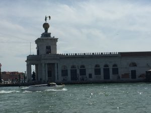
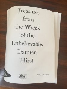
Those are my Damien Hirst-related thoughts after visiting “Treasures from the Wreck of the Unbelievable” at the Palazzo Grassi and Punta della Dogana in Venice, the biggest hanger-on to this year’s Venice Biennale.

IMG_1355 IMG_1352 IMG_1350

IMG_1468 IMG_1470

OK, we already knew that Damien Hirst was all about money. Remember his 2007 diamond-encrusted skull, with 8601 flawless pavé-set diamonds?

Image result for damien hirst skull

Remember how relieved we were to know that all the diamonds were ethically sourced for the work? Were you tempted to buy one of the limited edition (1000) silkscreen prints with glaze and diamond dust on the skull, because you couldn’t afford the real thing?

Well, diamonds may be forever, but they just start as some crappy coal bits from the ground. Which isn’t nearly as interesting as finding a nature-encrusted long-lost sunken treasure in the sea. The brilliance of this Damien Hirst conception is somewhere in the realm of classic one- liner jokes: “why did the chicken cross the road” and its relatives, e.g., “why do firemen wear red suspenders?” and so on.  At the Dogana we even are treated to a pithy epigram, presumably from the artist’s own intellect, slightly less deep than the waters from which these treasures were “rescued”: “Somewhere between lies and truth lies the truth”

IMG_1169

Even Bruce Nauman does better than that!

Image 6-5-17 at 11.17 PM

It’s impossible not to concede that Hirst’s double-whammy exhibition (two major venues) is spectacular and brilliantly conceived. (Perhaps the guy who originally thought of asking why a chicken crossed a road was no dope, either.)  But since the joke is so lame, one is mostly overwhelmed by the spectacle and the presumed cost of arranging it all. Sort of Las Vegas, but without the fun. Hirst has made a lot of money in the inflated art market. After all, why should the dealers be the only ones to get rich? And the cost of creating his fantasy – surely many millions – has not been revealed (so far). Nor has the hefty investment of his patron, François Pinault, owner of Christie’s and a lot more, to make this greatest show on earth (well, in Venice, anyway) possible. Supposedly the works have been offered to collectors at prices start at around $500,000 apiece and rising to upward of $5 million. But they aren’t on the market yet (or maybe they are), so who knows.

The artifice could be considered “brilliant” if it weren’t such an obvious and shabby hoax. I have a long-time hoax fetish, so after an artist friend of mine told me he was confused when he first visited the show, thinking it might really be an underwater discovery, I was excited at the prospect that someone had carried it off. But alas, it’s lame. You never get sucked into the story, despite a 72-page booklet (free with entry ticket!) and

IMG_1189

the staggering amount of technology and money and thought and analysis that has gone into making it an exciting hoax. It’s not even a fun hoax. A few years ago my college classmate, Arthur’s, wife sent us all an e-mail telling us that Arthur had died, and we responded with condolences and reminiscences. So we were pretty pissed off when Arthur told us he was still around (sadly, in the meantime his wife has died). But we got the idea that we all had our collective leg pulled and that the hoax had worked.

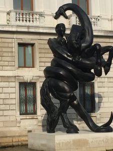
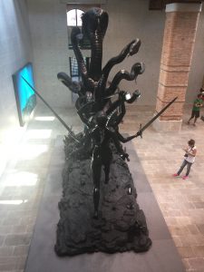
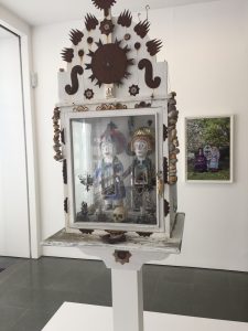
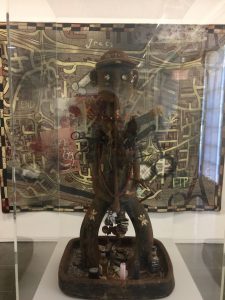
The fantasy that Damien Hirst creates is about the discovery of a sunken ship, the Apistos, off the coast of East Africa. The owner, a freed slave, who lived between the mid-first and early second centuries C.E., had amassed one hundred fabled treasures – “commissions, copies, fakes, purchases, and plunder” – and after the vessel foundered, all of this “lay submerged in the Indian Ocean for some two thousand years before the site was discovered in 2008.” A model of the ship has been created, along with a sophisticated video assist — touch-screen and all — that helps you navigate (pun intended) the ship’s interior to see where the treasures are believed to have been before the Apistos sank.

IMG_1069

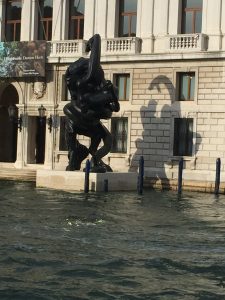
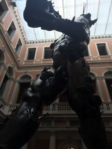
The exhibition displays the discovered objects, as well as spectacular films — the kind we see in science museums — documenting the raising of these treasures from the ocean’s floor. Watching recovery sea divers at work, and then seeing those very objects in the gallery should be thrilling. But it isn’t. How not to think about what it must have cost to create these objects, hire the ships and divers, pay for underwater film crews, put the artifacts into the ocean (or water somewhere) just for filming and then get them back up for display. It’s staggering! An amazing theatrical feat! Something on the order of Lon Chaney in “Hunchback of Notre Dame” or Arnold Schwartzenegger in “Terminator.” And while it may be extensively photoshopped, all the photo and film imagery looks really real.  (But remember, if you go to Atlantis in the Bahamas you might even find yourself in the water and have more fun.)  Then there’s the cost of the studio assistants (many!) to mold and carve and assemble all this stuff, some of which is immense, rising several stories inside (and outside) the fabulous exhibition spaces.

IMG_1184

This must have required a range of quite specialized  skills — involving more than what’s probably in the toolkits of the the many wannabe artists who are often studio assistants.  Simply supervising the entire confection has to have been incredibly labor intensive – and costly.  This could be a Harvard Business School management case study.

IMG_1051

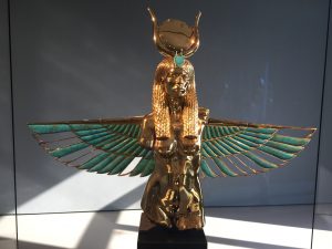
Which is why I came away thinking mostly of deep pockets, and of all the HBS MBA’s who will be adding these things to their collections once the show is over.  And there’s a lot of stuff:  bronzes, marbles, carved precious stones, gold, and combinations of all of these.  It’s additionally reassuring to know all that glitters here really is gold.

IMG_1066 IMG_1176

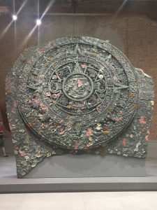
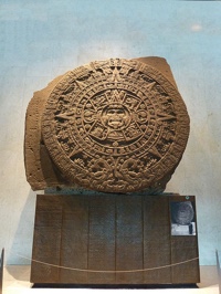
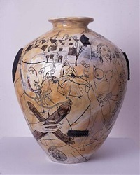
That should suggest a wide price range for the various galleries who will carry on the artist’s exercise in ripping off the public by ripping off collectors. But hey, we already know that a lot of collectors want to be ripped off. Otherwise they might worry that they aren’t genuine collectors.  Anyone want an Aztec sundial with sea creatures attached?

IMG_1170

Almost better than the one in Mexico City’s National Museum of Anthropology:

Image 6-5-17 at 10.51 PM

This is not to suggest that the exhibition(s) doesn’t have its thrilling moments. Who would have thought that an image of Jane Curtin as Connie Conehead

IMG_1179

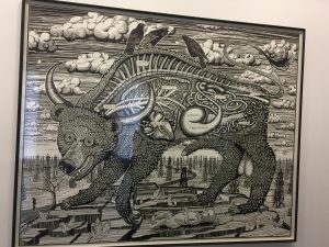
would have made it to the bottom of the Indian Ocean two millennia ago. Cif Amotan II, the freed ex-slave who amassed this treasure before his ship sank, obviously had very eclectic tastes (and was a SNL fan to boot). Mickey Mouse and a lot of other lesser-known characters also make their appearance here, as do a few Jeff Koons-type figures,

IMG_1180

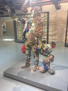
and even several Nancy Graves knock-offs (who knew that

IMG_1058

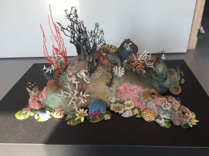
Damien Hirst ever heard of Nancy Graves?). But Nancy Graves (1939-95) lived in the olden days, and was just a regular very talented artist working in less opulent materials (see below).

th

I kept thinking of one of my favorite “expansive” art works: The Marie de Medici 24-picture cycle of paintings at the Louvre, painted for the Luxembourg Palace between 1622 and 1625 by Peter Paul Rubens and (probably) a slew of studio assistants.

th th th

Rubens must have run a pretty complex shop to handle some of these big commissions.  And he achieved some serious status: raised by Philip IV of Spain to the nobility in 1624, and knighted by Charles I of England in 1630, he even made a lot of money.  But Rubens was a obviously piker compared to Damien Hirst!

And always the former museum person, I kept thinking of all the museums that could use this sophisticated and costly technology and installation know-how to enhance the accessibility of their not-fake collections.  So many museums for which this expertise would enrich entire communities, not just the privileged art groupies (including yours truly) who trek to the Biennale biennially.

Try to imagine yourself spending a whole evening with your uncle who does nothing but tell corny jokes. You don’t want to be rude and tell him to fuck off, because he’s your uncle. You don’t want to groan and roll your eyes too much, but you can’t help it and you hope his hearing and seeing might not be too great, so he won’t notice. This expensive extravaganza is sort of like that. You get your ticket and you hope that maybe, just maybe, around the corner you’ll discover something new. But you won’t. Good god, Messrs. Hirst and Pinault, at least try to fool me once!

Chairs: Mixed Messages

The devastation from recent earthquakes (2010, 2011, 2016) which struck Christchurch (NZ) make the city look a lot like Berlin in the 1990’s: ruin, demolition, cranes, and construction sites everywhere.

IMG_6890

IMG_6848

An impressive overview of what Christchurch looked like pre-earthquake can be seen in a profusely-illustrated book by John Wilson http://www.nationwidebooks.co.nz/author/john-wilson.  The loss to architectural history is probably a major boon to the construction industry, the number of construction workers presumably matched by the number of suppliers for steel, glass, concrete, etc.  It boggles the mind!

Disasters also inevitably generate memorials, and Christchurch has managed a powerful, albeit understated, one.

IMG_6838

An array of empty chairs occupies a field across the street from the city’s 2013 celebrated so-called “Cardboard Cathedral” (officially Transitional Cathedral) by noted Japanese architect, Shigeru Ban (about which I will write separately).

IMG_6847

The work of artist Pete Majendie http://www.185chairs.co.nz/, this memorial is as simple and eloquent as any I’ve seen: 185 chairs, one for each person killed in the February 2011 quake.  All the chairs are white — kept clean by volunteers — and mostly different from one another.  Simple side chairs, comfy easy chairs, children’s high chairs — coalesce to suggest an uncanny feeling of variety that personalizes what might otherwise feel anonymous.

IMG_6840

Perhaps most heartbreaking is the infant seat in the front row.

IMG_6841

In our culture we focus so much on perpetrators and victims, on families and stakeholders, that one is struck here by the absence of the many added layers of meaning and interpretation which often accompany memorials — perhaps because the perpetrator here was Mother Nature, and one is confused about just how angry one can be with her.  But who is to plumb the depths of grief in the survivors’ feelings?

So it was somewhat startling to walk directly from this memorial to the Christchurch Art Gallery https://christchurchartgallery.org.nz/ and find yet another chair iteration — here a decorative and celebratory one.

IMG_6854

IMG_6863

IMG_6860

Hanging above the main staircase is an array of chairs and fluorescent lights that add a festive note to the museum’s modernist architecture, designed by the Buchan Group, who won a 1998 competition (limited to New Zealand architects).

  1. IMG_6888

The massive glass facade creates a welcoming vast lobby space (free admission!), and the capacious, serene galleries (filled with a range of interesting and engaging exhibitions) give no evidence of the museum’s use as the Emergency Operating Centre following the earthquakes. The building only reopened in December 2015, after repairs were made to its extensive damage.

But all of a sudden this floating array of chairs felt out of place — mocking the simple chair memorial I had just seen, a mere ten-minute walk away.  Which is, of course, a lesson in how easily we read and misread what we see.  Because we can’t help but add what we know to what we see.  Indeed, art museums play an important role in assisting our understanding of this.  I also couldn’t help but recall Don McLean’s line, “…empty clothes that drape and fall on empty chairs…” http://www.songfacts.com/detail.php?lyrics=12780 in his dirge-like Starry Starry Night, which matched my sense of the Christchurch earthquake memorial.  In this city empty chairs cascading near a museum ceiling feel somewhat less joyful than the architects/designers likely intended.  And 185 of them in a field can be splendidly eloquent.  Such are the ironies of contexts and their mixed messages.

Six of one…. Libraries vs. Museums?

I can’t think of a more inspiring NYC institution than the New York Public Library.  It’s still rich with the unnecessary spatial trappings that are often too costly to be included in today’s buildings (with the possible exception of the new Calatrava extravaganza downtown).  I like to think that the grand staircases outside and in, elaborate lobby spaces, murals, and inevitable sense of ceremony impact even those serious folks who labor daily in the glorious Rose Reading Room or in one of the less majestic study rooms.  All those amenities may not address the NYPL’s main raison d’être, but I find them a lure even though I’m not a regular researcher any more.  And a recent visit reminded me of the various anti-institutional protest movements of the late 1960’s and early 1970’s, which ranted not only against cultural elitism and workers rights, but also about the off-putting architecture of museums, with their classical facades and elaborately-staired approaches.  That puzzled me since, growing up near what was then Buffalo’s Albright Art Gallery — with its elegant Greek revival building, designed by Edward B. Green for the 1901 Pan-American Exposition (but not opened until 1905) — I always delighted in the sense of going to a special place for a special experience; not off-putting to me!  In those days one walked up lots of stairs (not quite Rocky’s climb at the Philadelphia Museum of Art, but nevertheless awesome for an impressionable child); that was before Gordon Bunshaft’s now-iconic, International Style, 1962 addition made entering more practical, if also more banal.

I remember that feeling of uplift every time I wander into the NYPL, as I did to view the strange, but fascinating current exhibition, A Curious Hand: The Prints of Henri-Charles Guérard (1846-1897).  Not on my radar screen, Guérard turns out to be a masterful printmaker both for technical prowess and for the range of his visual interests.  Working to help Manet with his own prints, and producing copies of etchings by famous predecessors such as Rembrandt, Guérard’s main interest for me is the range of bizarre, occasionally kinky (not sexual!) imagery.  He plays with Japonisme influenced by Hokusai. IMG_5792

He channels Poe, who had recently been translated by Mallarmé, in one of the show’s most impressive images. IMG_5783.

He puzzles with inexplicable, but exquisitely-executed, grotesqueries: who knows what a skull has to do with origami? IMG_5785 I’m not sure you come away from the exhibition with a clear understanding of what this guy was all about, but for sheer visual and technical delight, it’s worth a visit.  And you get to experience that great building to boot!

And it’s a short walk from the NYPL to the Morgan Library and Museum.  Changing its name a few years ago — presumably because being a library wasn’t sexy enough, and the Morgan folks hadn’t heard that museums are (citing a young Renzo Piano, long before he screwed up the Morgan’s architectural ensemble) “dreary, dusty and esoteric institutions” — it’s still one of the most wonderful islands of pleasure on Manhattan Island.  It’s also where one always stretches one’s concept of visual pleasure, no more so than with the current Emily Dickinson exhibition, I’m Nobody! Who are you?  You can really get sucked into the glories of her penmanship and a few (not enough!) poems in her hand.  I was relieved to find one of my childhood favorites: IMG_5839

“I heard a Fly buzz — when I died –”  And here one also sees Dickinson less as the famous recluse of our collective mythologies and more as someone engaged with others.

A small exhibition in the Morgan’s Thaw Gallery, Delirium: The Art of the Symbolist Book is interesting for somehow drawing together a range of imaginations that connect Guérard and Dickinson with the Symbolists here, among whom are writers and artists Charles Baudelaire, Stephane Mallarmé, Paul Verlaine, Alfred Jarry, Maurice Maeterlinck, Odilon Redon, Maurice Denis, Pierre Bonnard, Henri Fantin-Latour, Henry van de Velde, and Fernand Khnopff.  I noticed a book (Les Vierges illustrated by József Rippl-Rónai) by Belgian writer, George Rodenbach (1855-98), whose compelling short Symbolist novel, Bruges-la-Morte, I discovered after it had been featured in one of the WSJ’s weekly Masterpiece features a few years ago.  It was also fun to see Paul Verlaine’s Parallelèment (1900) “considered to be the first modern artist’s book” illustrated by Pierre Bonnard, in its deluxe edition  All these years I thought my fancy little edition of the book was deluxe; I guess not.

IMG_5857

So what’s a library and what’s a museum?  Who the hell cares?

Is everything a museum?

In 2006 I wrote an article in Curator: The Museum Journal alleging that these days everything is a museum.  I admit that the concept was generated by passing maple syrup museums in drives around New Hampshire and Vermont.  But my ‘museum’ citations ended up ranging from Judy Garland to department stores to cabaret.  However, I was especially interested in how the term was used in connection with music, and cited both NYTimes critic, Bernard Holland and conductor, Marin Alsop, respectively referring to a Mozart opera and orchestra music as “a museum.”  That thought came rushing back at Thursday morning’s New York Philharmonic open rehearsal — the first of three Tchaikovsky-centered concerts: does this sort of programming suggest that the NYPhil is turning into (God forbid!) a museum?

Let’s get the irrelevant stuff out of the way.  I realized that The Donald (do I really have to call him my President?) was correct in his comments about the difference between his and Obama’s Inauguration crowds.  Looking out at the sea of white hair in David Geffen Hall (do I really have to call it that?) — because who else can attend an open rehearsal on a weekday morning — I had a revelation: that white you saw on your TV screen was really the vast senior citizen section on the Mall, and it was packed with white haired older folks (the bald heads didn’t glisten because it wasn’t a sunny day).  So let’s stop discussing alternative facts.  You win, Sean Spicer!

Guest conductor Semyon Bychkov really manages Russian music persuasively, despite looking a bit like Harpo Marx, if we had ever gotten to see an aging Harpo.  (His curly mop is not to be confused with that of his conductor colleague, Simon Rattle, fullsizeoutput_400c whom I’ve nominated to play Ann Freedman, fullsizeoutput_400a if they ever make a movie out of the Knoedler art forgery debacle: totally different hair!)  The combo of conductor Bychkov and pianist Yefim Bronfman (I’m assuming no relation to the rum-running-turned-mogul-turned-big-time-Canadian/American Jewish philanthropy-family) definitely raised the question about whether Russians do better with Russian music than ordinary musical interpreters.  A sensitive issue in the cultural realm!  Are African-Americans best positioned to explicate African-American art?  The Smithsonian’s National Museum of the American Indian delegated the creation of its exhibition content to Native Peoples, on the assumption that only they can really tell their own stories.  Thorny issues, which perhaps I’ll address in another post sometime.  But Semyon sure does make a persuasive case!  And I should add that my late mother adored him during his time at the Buffalo Philharmonic Orchestra (where I cut my music-listening teeth).

However, that’s not the museum issue that interests me here.  Rather, I was forcefully struck by how Tchaikovsky brought out the crowds.  I’m a regular at open rehearsals, so I can tell when the audience suggests we’re moving into blockbuster territory.  I’m relieved to know that he’s a draw even a month after Nutcracker season is over.  And I can’t help but think of museum analogies.  London’s National Portrait Gallery did a credible Picasso Portrait show (which I reviewed for the WSJ) that or may not have brought the anticipated crowds which presumably provided a rationale for this exhibition (I don’t check on numbers).  I’m not sure whether three shows invoking the sacred name of Caravaggio – in London, New York, and Milan did as well, since the lure was a bit of a stretch.  (The London and New York exhibitions, however, were each interesting and important in different ways, even if people didn’t queue up for them.)  Never underestimate the power of a lure!  It’s advice I regularly give my mouse friends.

So while listening to Tchaikovsky’s lush and dramatic 5th Symphony, I remembered [Vitaly] Komar and [Alexander] Melamid — once an artist team but now split — and their “Peoples Choice” art.  The artists commissioned polling companies in the 11 countries—including the United States, Russia, China, France, and Kenya—to conduct scientific polls to discover what they want to see in art. The use of polls was meant to mimic the American democratic process. Komar said, “Our interpretation of polls is our collaboration with various people of the world. It is a collaboration with [sic] new dictator—Majority.” (this a Wiki-citation).  I love Tchaikovsky’s 5th, but it seems to fit perfectly the ideas one might have about what kind of music would appeal to an international crowd — albeit one with the sitzfleisch to manage about 45 minutes of noisy drama.  Almost like a Rogers & Hammerstein musical: you can actually walk out humming the tunes.  Bychkov milked it beautifully for all it was worth, and the orchestra responded to him.  Because my aural sensibilities work better when visually enhanced, I tend to zoom in on certain parts of the orchestra, and today it was the double basses (8 of them!), and a new understanding of how critically they underpin much of Tchaikovsky’s drama, along with NYPhil tympanist Markus Rhoten (I often zoom in on him).  I assume someone will be taking attendance to check on whether a three concert series of Tchaikovsky gives the NYPhil the [presumably] anticipated blockbuster boost.

The rest of the program wants a somewhat more serious listener.  To call Glinka’s Valse-Fantasie ‘slight’ may be giving it more than its due.  Pleasantly melodious, it still seemed longer than the six minutes announced in the program notes.  But as an important Russian predecessor composer, Glinka (1804-57) apparently loomed large for Tchaikovsky (1840-93), so it was a fitting way to begin the program and the series.  More puzzling to me, but infinitely more rewarding, was Tchaikovsky’s Piano Concerto No. 2 (G major, Op. 44) with Yefim Bronfman soloing.  I’ve only heard it on the radio, so was excited to hear it in the real.  I’m not usually highly critical of the hall’s famously-problematic acoustics, but felt that the orchestra often drowned out the piano during the first movement, perhaps over-accentuating those many sections when the piano has brilliant solo passages, which Bronfman performed with dazzling ease.  Accustomed to concertos in which the interplay between ensemble and soloist feels more natural, this first movement is somewhat jarring.  On the other hand, the second movement is so sublime that it’s worth going to the concert just to hear it. Rich solo violin and cello parts play against the piano and the orchestra in a rich, subtle, and lush array that makes the 5th Symphony feel even more bombastic.  (This was a rehearsal, so the symphony was played first.)  My usual favorite object of zooming-in devotion, first chair Carter Brey, played beautifully, as did newish concertmaster Frank Huang, and while there were a few gorgeous moments of them as a duo, it never quite made it as a piano trio — even when I kept anticipating that, having in mind Tchaikovsky’s Piano Trio (in A minor), one of my all time favorites in the gloppy music realm.  (I have long favored piano trios by practically everyone.)

The concert’s program notes include a fascinating series of anecdotes about Tchaikovsky’s April/May 1891 visit to New York for the opening of Carnegie Hall.  The NYPhil will probably return part-time to Carnegie Hall soon, as the next iteration of [Philharmonic Hall/Avery Fisher Hall/] David Geffen Hall starts next year.  What goes around comes around.  Yet another connection to this brief Tchaikovsky celebration.  Does it suggest that the NYPhil is stuck in musty museum-land?  Or is it like museum-related blockbusteritis?  Probably a bit of both.  But that shouldn’t make us dismissive of the enormous pleasures gained.  And for me the concerto’s second movement alone justified the program.  Moreover, Alan Gilbert (I’m a big fan of his programming!) has been fairly ambitious in promoting new and interesting musical experiences that actually enrich our listening to the museum pieces — most recently the extraordinary Fourth Symphony by Wynton Marsalis.  Looking at older, even much-derided and unfashionable art (e.g., the once-celebrated Lawrence Alma-Tadema,whose work is currently on view in the Netherlands), enlarges our vision and refines our sensibilities.  That’s just as true for listening to a wide range of musical experiences.  So let’s hear it for the NYPhil’s important museum role!

Does art need passion?

MoMA’s current exhibition “A Revolutionary Impulse: The Rise of the Russian Avant-Garde is important and interesting (and enjoyable!) for several reasons.  The show reminds us that a great museum has rich holdings in some (not all) fields, enabling major exhibitions without loans.   This is not just about being cost-effective (when have museums ever cared about that).  It’s also about plumbing the depth of collections to display works that may have been acquired primarily for the museum’s archival role, so now the public gets to see more than just signature works.  This rich MoMA assemblage also quietly celebrates some major donors (e.g., McCrory/Riklis, Judith Rothschild Foundation), while providing an [unannounced] first NYC commemoration of the centennial of the Russian Revolution (I assume there will be others).  It’s also a show of manageable size (whew!).  And a wonderful followup to MoMA’s monumental (and exhausting!) 2013 exhibition “Inventing Abstraction: 1910-1925”.

I was especially struck by set of Goncharova lino prints on the wall before entering the show; she fuses Cubist ideas with allusions to both Russian and Western iconographic ideas, and makes us especially aware of how imaginatively she cuts the linoleum (was it a newish material in 1914?) to create active spatial effects.  Then we see her 1913 (0r 1911) Rayonism, Blue-Green Forest announcing (yet again) expressionist tendencies that would soon be declared null and void (as the exhibition continues).  (Did Jack Tworkov ever see this painting?)  Nearby a small Kandinsky watercolor (Improvisation 1914) is so delicious it’s in that special category of “don’t wrap it; I’ll eat it here!”

The exhibition creates a sense of excitement as we watch these artists in their rejectionist mode, believing that they can somehow start from scratch to both re-imagine and create art anew.  Some of the works by familiar artists (Tatlin, Malevich) are almost icons of modernism, so it’s difficult to see them anew.  But the exhibition contextualizes the familiar with works I hadn’t seen before, which is one of its strengths.  Trying mightily to defy tradition, the most persuasive works still rely on conventional ideas such as space, color, form, balance (or attempts at denial of their importance).  And this valiant fight against what came before (even worthy of a kind of high-school-poster diagram) ends up feeling amazingly sterile and lacking in emotion (if we get our “icons of art history” emotions out of the way).  There’s passion here — but it’s the passion of rebellion rather than aesthetic passion.  Evidently these guys are afraid to express feeling: that’s so yesterday.

But oh, how that changes when they get excited by technology.  Passion re-enters with a vengeance for the adventure of exploring the possibilities of film.  Clearly the excitement of playing with new mediums involved a depth of feeling that overwhelms spare abstraction.  The gallery with the films (Eisenstein and more) makes this especially evident, as does the one with the Rodchenko photographs (definitely my favorite part of the show!).  Lots of passion here!  Along with subtlety in composition, focus, and printing.  Photography doesn’t get any better than this.

The “passion” question stuck with me, so that this evening, at a Zankel Hall recital, I kept asking the same question.  Jean-Guihen Queyras, cello, and Alexander Melnikov, piano, gave technically astute performances.  But I wanted more.  A new piece by Yves Chauris (b. 1980), commissioned by Carnegie Hall, explored cello techniques (use and abuse of the instrument?) beyond anything I’ve ever heard, and it was sort of interesting, but also somewhat bloodless and theoretical.  I kept thinking of Russian constructivism.  Beethoven’s A Major Sonata (one of my all-time loves) followed that and sounded a tad antiseptic, despite the competence of the playing.  But after intermission things changed (do performers tipple in the Green Room?).  Anton Webern is still a stretch for me, but “Three Little Pieces for Cello and Piano” (all of 3 minutes long!) was rich and romantic (and written in 1914, when that delicious Kandinsky watercolor was done) — and without pause they seguewayed right into Chopin’s G Minor Cello Sonata with a passion that was lacking in the first half of the concert, providing richly felt sounds.  It made me think of Jerry Lee Lewis and Kris Kristofferson: “Once More With Feeling.”


Lousy cultural journalism!

If you missed this, the NYTimes ran a politically-motivated hatchet job story by Robin Pogrebin that deserves to be read as an example of a major Nothingburger!  Here’s the letter I sent to Robin.

Hi Robin:

I kind of get what you were trying to do with the Mercer story, but the only valid issue — which you didn’t even allege (and which Ellen Futter seems to refute) — is whether Mercer’s board membership has any impact on the museum’s intellectual and scientific positions.  Otherwise, it’s just some rich person on a board.  What else is new?  You don’t even suggest that the money comes from societally harmful investments (whatever they might be).
We don’t need to go back to scoundrels like Henry Clay Frick and Andrew Carnegie to remind us of how slippery these slopes are.  David Koch’s name at Lincoln Center and the Met can be seen as problematic (and with potentially far more impact on what’s happening in our country).  And the Sackler name — visible all over the place (the Met, Brooklyn Museum, Smithsonian, and endlessly in London) — could be especially worrisome for those of us worried about the current Oxycontin epidemic; the NYT has written a lot about the epidemic but not about the people who own Purdue Pharma (and about how they are now going after foreign markets to make up for the attacks on them in the USA).  Do we expect Judy Chicago to publicly disavow her central place in Brooklyn’s feminist art center because of where Elizabeth Sackler got her money?  Should you be interviewing Arnold Lehman about this?
Selective, gotcha, journalism may make self-righteous liberals feel good, but I expect more from you.
Cheers,
Tom Freudenheim

San Francisco museums – worth reading!

Any large urban area with a slew of museums could benefit from directors who clarify their museums’ roles and programs.  This might help develop more loyal publics, while also leavening the inevitable competitiveness with a sense of community.  The Bay Area cultural scene should be enriched by Hollein’s rethinking.

http://www.sfchronicle.com/news/article/Max-Hollein-s-ideas-may-change-SF-museums-role-10637741.php?t=b33619475c&cmpid=fb-premium