Alice Neel and Me and More

PRODIGAL SON

Contemplating Simone Martini’s Christ Discovered in the Temple
(published, with illustrations, in Jewish Quarterly, London, Fall 2004)

American boys of my generation (and earlier ones) grew up in the firm belief that anyone could be president. We had gone from FDR to HST to Ike, so the opportunities appeared reasonably open. But not for me. I was born in Germany, and only a “natural born citizen…shall be eligible to the office of president” (as our Constitution puts it). I wasn’t certain of the precise language, but I was always aware of that one limitation in my career options.

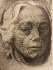
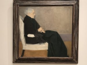
I did, however, go through a brief Jesus fantasy. It was in 1978, during one of several sittings for Alice Neel, who painted a wonderful portrait of me. (No thanks to me or to that portrait, her soaring reputation has put my canvas likeness far out of my reach financially.) Aside from the feeling of privilege that this extraordinary painter had asked me to sit for her, part of the fun was hanging out with such an outspoken and outrageous lady. She was then in her late 70’s, as nimble mentally as she was physically, enjoying a surge in her career that also loaded her with iconic status in the women’s movement. I recall sitting patiently still, looking out of her strategically-placed corner window at 107th Street and Broadway, discussing Edmund Wilson’s Memoirs of Hecate County, which I was reading at the time. I was astounded that Alice remembered all the details of the story, almost quizzing me, although she said she had only read it once, when it was first published: 1946, I confirmed in my paperback. Studying my bearded face, as she painted and we talked seriously, Alice suddenly decided that she should paint me in a Crucifixion. It was a subject she had never painted; it was about time; and she told me she was inspired by my Talmudic look, which would make me an appropriate model for Jesus. Besides, she said it was important that the model be Jewish; we had discussed the Holocaust and her prescient 1936 painting, “Nazis Murder Jews” – a subject of no interest when she painted it.

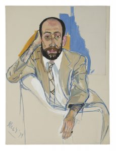
“Would you really do that?” my father asked, when I told him about this exciting opportunity. “Why not? She’s an artist I admire a lot,” I replied. I had minor misgivings that someone might look at the painting and say, “hey, I know that guy!” But other than that, I was comfortable with the idea. So Alice and I carried on intermittent conversations for some months, trying to make dates for a sitting. I would have to travel up from Washington, she was increasingly invited to speak all over the country, but by the time of her 80th birthday celebration (in Charles Stewart Mott’s expansive Fifth Avenue penthouse) she was still serious about fitting this project into what had become the life of an art celebrity. Meanwhile, given Alice’s famous portraits of people in various stages of dress (although my portrait has me in a suit), I was contemplating what I would (or wouldn’t) be wearing while hanging from the Cross. I knew I wasn’t going to be suffering the physical pains that must have beset F. Holland Day, when he put himself in Jesus’ place for photography’s sake (this was long before Mel Gibson’s vulgarities). And I was amused at the notion of a loincloth or jockey shorts or boxer shorts or a robe or whatever Alice might have in mind, which was never quite clear.

But then Alice Neel died after a bout with cancer (1984) and my Jesus daydreams died with her.

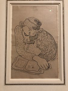
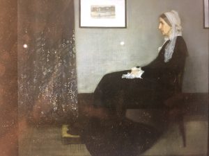
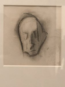
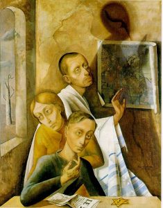
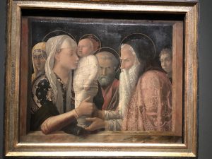
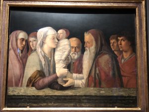
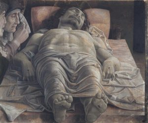
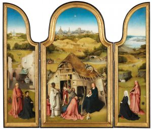
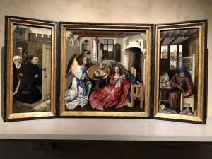
Until recently, when I saw Simone Martini’s extraordinary small masterpiece, Christ Discovered in the Temple (1342, Walker Art Gallery, Liverpool). My Jesus fantasies returned, even before I read one of the thoughtful wall texts that said “he depicts a human drama with which we can still identify today.” Here is a work that demands scrutiny while directing the viewer’s thoughts down very personal and possibly even awkward paths.

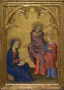
My father wasn’t a carpenter, although the family business in Berlin was lumber and veneers. As far as what I can tell from my mother’s quite frank discussions of her youth, she wasn’t a virgin. My older brother carried a not-entirely-unjustified resentment, feeling that our parents treated me as if I were a gift from God. But that’s not why I feel so at one with the young Jesus whom Simone Martini shows us confronting his parents. They have discovered him hanging out, and they are none too happy. We have each been discovered – somehow, somewhere – forced to face parental wrath. Think of poor Euan Blair a few years ago, having to confront his folks after a night out in Leicester Square; or the Bush twins caught for underage drinking. Think of the teenager running off to meet someone he or she has met on the internet. That sense of horror and embarrassment at being caught works on both sides of the equation: the catcher and the caught both having to come to terms with how they relate to each other.

So why do I identify with this extraordinary painting? I was about to turn 20, finishing my third year of university, and had gone off from Boston to San Francisco for my grandmother’s 80th birthday. Cadging a ride west with a fellow student had been relatively simple. And as instructed by my concerned parents, I dutifully telephoned them every night to tell them I was safe. But to find a ride back (I need to return quickly for my summer job) turned out to be more complicated, requiring me to scour the adverts in San Francisco newspapers. That eventually yielded me a driver, also in a hurry to get back east for a summer job, so we had to share driving, with a kind of steady rota of three passengers driving steady, night and day, barely stopping for food and petrol. So I forgot to call home. Or did I forget? When I finally arrived, my parents were angry and silent and accusatory. How could I not have called, as we had agreed I would? (I didn’t remember agreeing; I just thought I was being a good son.) My parents told me that they had aged twenty years just from worrying during those two anxious days. They had even listed me with the police on an APB (all points bulletin) to have me located. I felt guilt and shame – and my own kind of anger. When I reminded my mother of this incident, shortly before her death at 93, telling her that, given the aging I had put her through in 1957, she was really 113, she growled at me that it still wasn’t funny. At least she didn’t tell me that I would understand once I had children, because my own sons were by then quite grown up.

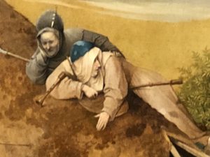
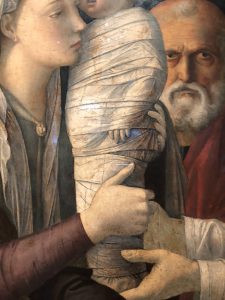
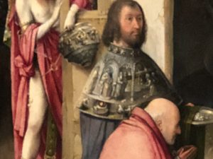
That’s what Simone Martini’s lovely little painting brings back to me. And much more. There are the complex reactions of parents disappointed in their son. “Son, why hast thou thus dealt with us?” is inscribed on the book, which sits in Mary’s lap – a quotation from Luke 2:48. (Jewish translation: “How could you do this to us!!”) Simone Martini’s parental pair engages in what would have been some sort of role reversal in my family. Truer to her ethnic roots, my mother more likely said “how could you do this to your father?” Here, Joseph points to Mary with a slightly angry, but mostly despairing, look on his face, as if to say, “Look what you’ve done to your mother!” This is emphasized by Joseph’s left hand protectively on his son’s shoulder, his right hand pointing at his wife. Mary is somewhat impassive (maybe she wasn’t really a Jewish mother), sad to find herself in this position, pointing to her husband, wishing she could figure out how to make excuses for her son. It’s a not unfamiliar game of parental ping-pong. They both also feel a sense of shame at having been placed in this position by their son. It’s frankly embarrassing. They are as angry at that indignity as they are at the actions of the lad.

Jesus, on the other hand, is not ashamed at having done wrong. Indeed, as far as he’s concerned, he has done no wrong. Jesus was spending time in the Temple toward a noble end that his parents couldn’t grasp: “Didn’t you know that I must be in my Father’s house? (Luke 2:49) He has his own ideas of what’s important, even if he’s only 12; they don’t entirely agree. They were worried about him. The artist makes clear that this is not simply a youth being scolded by his parents for wrongdoing. This is a standoff! Jesus is angry, his eyes almost cold. He affects a look that combines some slight sense of regret at disappointing his parents, with a strong feeling of chagrin at being hassled by them. Is he angry at being caught, or at feeling the injustice of their accusations? After all, he’s asserting his independence –”separating” is what we call it these days – and he seeks understanding, not reprimand. He has complicated feelings, as do his parents. This duality is familiar to most of us; we have been there. We recognize ourselves as children; we recognize ourselves as parents.

This wonderful small panel painting gives us a moment unfamiliar in an art tradition that gains most of its tender or grotesque insights from other elements in the life of Christ. The baby Jesus with the Virgin, in all their variant manifestations, generally presupposes a combination of maternal relationships with the overwhelming iconic status of the image itself. The multiple Passion scenes convey the pain and suffering which the devout are meant to re-experience as a devotional exercise. (“In every generation, it is incumbent on us to see ourselves as though we came out of Egypt.”) Simone Martini has given us a wholly different spin on the Holy Family. This painting, executed in 1342, when the Siennese painter was living in Avignon, is also rich in colour and compositional elements; yet it’s the emotive qualities that are most forceful.

The greatest works of art impress us not with the virtuosity of their technical qualities alone, even when we gasp at such, but with their ability to help us explore the inner feelings we all share. The artist as psychic archaeologist – or perhaps the artist as shrink – is an infinitely more powerful role than we are accustomed to ascribing to the creators of our museum’s most awesome wonders. I am grateful to Liverpool’s small masterpiece for helping to evoke, and even excavate, so many of these feelings.

Addendum (not published with this article):

Sometime in 1978 I was on a panel (or symposium) at the New School (while I was working at the NEA).  After the program was over, someone came up to me and handed me a little scrap of paper (I may still have it) on which was written “I must paint you before I go to the happy hunting ground. Alice Neel.”  So I asked the person which one was Alice Neel and she pointed out an old lady still sitting in the front row (people were leaving the room).  So I went over to her and said something like “Wow! Did you really mean this?” and she said, gruffly, “I wouldn’t have written it if I didn’t.”  So she said I should get in touch with her and she gave me her phone number.  (We were living in Baltimore; I was working in Washington.)

So I called and we made a date.  I asked what I should wear and she said (gruffly) why was I asking.  And I explained that I had seen some of her paintings of people in various stages of undress.  She said I should wear whatever I wanted.  I’m assuming our first sitting was in summer because in the portrait I’m wearing my light tan summer suit, and a short-sleeved white shirt.  When I arrived she said that was fine and also took me into the room where her paintings were stacked and she showed me all the people she had painted who were dressed (Stewart Mott, Henry Geldzahler, etc.) to assure me she didn’t only paint nudes.  She posed me a certain way, making sure I was comfortable to stay that way for a long time.  Then she painted and we chatted.  I returned to NYC several times for more sittings, but I don’t remember how many times.  The painting includes a bit of collage, canvas on canvas, which may be there because of some damage to the canvas while Alice was working on it, so she repaired it and then just painted over it.  I’m not sure; but as far as I know Alice didn’t do collages.
When it was done, I asked her if I could buy it, and she said she wanted $13,000.  Well, that was way out of my range of possibility.  So I told my parents about it, and my father (who was in the jewelry/stone business), who also couldn’t come up with that much money, asked whether Alice might be willing to take a diamond or emerald in exchange for the painting — since I told him she was so fond of her daughter(s?)-in-law — so she might like jewelry for them.  But she said no, she wanted to get paid, and that was the end of that.  We stayed in touch however, since she wanted to paint me again, and we were invited to her 80th(?) birthday party at Stewart Mott’s apartment on Fifth Avenue, and then to the dinner (March 29, 1982) that Mayor Koch gave for her at Gracie Mansion to unveil the portrait she did of him.  Leslie and I were seated at Table #1:
Table #1: Honorable Edward I. Koch, Alice Neel, Richard Neel, Nancy Neel, Thomas Freudenheim, Leslie Freudenheim, Barbara Margolis, David Margolis
The painting has reappeared regularly.  It was on display in the window of the Graham Gallery on Madison (between 78 & 79 Sts.) around 1980-81, and lots of people walked by and told me they saw it.  Then it has been on consignment with a Berlin gallery (Aurel Scheibler) that has shown it in Berlin and also in their booth at the NYC Armory Show ca. three years ago.
I believe the estate or a gallery approached the National Portrait Gallery to buy it around ten+ years ago, but it was too expensive for them.  And when I became director of the Worcester Art Museum (1982), I recall that the museum borrowed the painting to have on view for my ‘installation’ — from the Robert Miller Gallery, which I believe was representing the Neel estate at that time.

A Death in the Family (with apologies to James Agee)

My amazing sister-in-law, Nina Freudenheim, has died (10th April 2020) in Buffalo, at age 83. She had been ailing for several weeks and, aside from an apparent slew of other medical issues, she apparently also had Covid-19. She leaves her husband, my older brother, Robert (Bob), her three children Rachel, Julie (Spencer Feldman) and Leigh, four impressive grandchildren Eliza (Derek Fay), Drew, Ethan, and Will. That’s the standard obituary part. But it doesn’t begin to express why Nina was such a remarkable woman.

Although she had been a working woman (office, theatre, etc.), when Nina and my brother married in 1961, I think the expectation was that she would settle into the wife-and-mother role that characterized so many women of her generation. And she managed to slip into that role with apparent ease – nurturing her three impressive kids, making sure they attended the best schools and would turn into productive citizens. (They did!) And engaging in the requisite volunteer activities, especially related to cultural and social issues, in a Junior League kind of way (although the Junior League likely wouldn’t have invited her.) Meanwhile, I have a feeling that my brother didn’t do a lot of diaper changing, and he probably didn’t help out in the kitchen a whole lot – again taking on the expected roles for men of our generation.

And then it changed. Nina opened her eponymous gallery in 1975, and from its very beginnings Nina Freudenheim Gallery was a center for a variety of impressive artists to showcase their achievements. Nina worked from her gut and her instincts were amazingly on target. Although we were both functioning in “the art world” we rarely discussed her artists or her choices. Yet, like the astute gallerist she was, Nina introduced me to a number of significant artists about whom I previously knew nothing.  Very little has been written about the challenges of running a small commercial gallery not-in-NYC – developing a clientele, making ends meet, retaining a sense of excitement about a constantly shifting series of artists and exhibitions for a relatively small audience. And having a significant impact on the range of art available for Buffalonians to view, despite its fine local art museum. I never quite understood the source of all the energy it took to personally schlepp art back and forth (from New York or wherever) without the staff underpinnings that larger galleries and museums rely on to make their work possible. But it was part of what drove her, because she clearly loved what she did, was committed to her artists (many of whom came to have major reputations after she first showed them), and never seemed to lose the psychic energy that it takes to keep that sort of venture going. And she was deeply devoted to Buffalo!

Perhaps Nina’s most directly visible art legacy is in her having overseen the art selection committee that commissioned the art that accompanied Buffalo’s then-new rapid transit stations (NFTA-Metro) in the early 1980’s. She skillfully managed what is always a highly contentious and political process, that resulted in public works by a wide range of artists such as Beverly Pepper, Stephen Antonakos, Charles Clough, Sam Gilliam, and George Sugarman.

And there is probably no way to  track the advice she provided to countless collectors. The Castellani Art Museum of Niagara University honored her last fall with an exhibition: For the Love of Art: A Tribute to Gallerist Nina Freudenheim.

The “love” part is what matters most, because Nina embodied that in spades. Along with art, she loved cooking and entertaining, and managed to do both with incredible grace and seeming ease. Small dinner parties always included imaginative flower arrangements to accentuate stylish table settings. Larger receptions involved a generous array of wonderful foods. Some of these parties were for her family or for her artists, and others were for visiting dignitaries coming to the Albright-Knox Art Gallery just down the street. The unifying factor in all of her hostess activities was Nina’s personal warmth, making everything seem like it had been a cinch – overseen by the life-size Deborah Butterfield horse in the dining room!

Most of all, love included her being an incredibly caring daughter to her hard-working, long-time-single, mother who lived past her centennial birthday (which I always imagined Nina would, too). While my own parents may initially have felt skittish about my brother’s marrying Nina, they quickly learned to adore and admire her; and she repaid that with love and the special care that they required in their old age. Her kids and grandkids (and my own kids) surely saw that love in many ways as well. But no one received as much of it as my lucky brother. Nina appreciated his eccentricities, and if, as often happens with older couples, there was a co-dependency relationship, it was really a deeply-embedded love relationship. I observed that during my last visit to Buffalo in December.  I could tell that both of them were ailing,  although (much to my amazement) Nina was still spending her days in the gallery, installing an exhibition.  But they were also complexly caring for — and terribly worried about — each other. I’m trying to come to terms with her loss. Which is why I’m writing – and sharing – these thoughts.

The Joys of a Museum Scofflaw!

Recent Japan travels reminded me of how museum rules and regulations are supposedly important for the protection of what’s on view, while also too often being arbitrary. But I could as well have thought of this elsewhere, since I recall being asked not to use a pen in some museums (SFMoMA comes to mind) – and even being provided with a pencil to use (the graphite point, with which I might puncture a canvas, presumably being less destructive to works of art than the ink of my ball point or fountain pen). Presumably my bona fides as a responsible visitor are not validated by something as insignificant as my ICOM and/or AICA card. That’s OK. I’m not a big fan of rank. The “no flash” camera rule seems reasonable, since it might annoy fellow visitors; but the argument museums often give is the destructive power of that flash of light on works of art (especially those on paper). I hope some conservator has done a thorough study of just how much damage is done by the occasional flash vs. the damage done by exposing the art to viewers at all. I can’t recall the last time I saw an actual flash bulb pop anywhere but in retro movies.

Demystifying museums has always been among my life goals, although I probably can’t point to very many successes in that endeavor, even after half a century of museum work. It’s what you’ve come to see that might be – hopefully will be – magical, not the institution that’s there to make it accessible to you. Trying to capture that magic and take it home with you seems like a reasonable urge. We know we can’t really “capture” the magic, but one can’t always restrain the impulse. In this age of smartphones, it’s no longer only the Japanese tourists that are camera crazy. “Kodak moments” have proliferated along with the demise of Kodak. In places with ‘unforgettable’ views one might even have to queue for the right spot to click the smartphone. The Louvre has tried to solve this problem, while creating new ones (maybe the newest definition of ‘distance learning’?) in its recent reinstallation of the Mona Lisa.

I was trying to figure out what lies behind the many museum photography restrictions in Japanese tourist venues (museums and other sights). It can’t be simply to protect the [often] non-existent rights to images, or some false sense of security. In a few places highly visited and space-restricted venues the goal is probably to keep traffic moving. So I applaud those rules, just as I sometimes happily flaunt them.

For some reason, while I was in Japan I was led to thoughts of my favorite rogue museum photo scoundrel. His name was Samson Feldman and he lived with his sister, Sadie, at 3900 North Charles St., a banal 1950’s(?) red-brick apartment house in Baltimore, near my own home, when I served as director of The Baltimore Museum of Art in the 1970’s. Samson was a delightful old man (at the time surely at least a decade younger than I am now), who traveled everywhere to see art museums. When I would take a trip to France or Italy, he told me proudly that he couldn’t go to see museums in Europe because he hadn’t yet seen all the ones in the USA! He was also an artisan of sorts (I still have a few silver objects he gave me), and a collector of antiques. I was under the impression that he had been an antiques dealer before I met him, but I can’t find any references to that. He was among the BMA’s most loyal followers, coming to every exhibition, and taking photos at openings, events, and of the exhibitions themselves. He often would send me a card with a photo of me (and my wife and/or children) taken at a museum event. He lived with his spinster sister, Sadie, in a well-appointed, but unpretentious, apartment filled with American antiques and lots of art books. Samson died in 1983, so I was delighted to see that Sadie, who died in 2005, gave the BMA their scrapbooks (now part of the museum’s Archives) of the photographs Samson took.  Sadly, however, there’s no mention of my favorite of Samson’s many photographs: at the Barnes Foundation, when it was under the watchful and policing eye of Violette de Mazia (1899-1988) – at that time still the commander-in-chief (and watchdog), who had worked for the quirky Dr. Albert C. Barnes and tried to carry on his mission following his untimely death in an automobile accident in 1951. (Despite speculation about whether de Mazia’s relationship with Dr. Barnes was more than colleagial, no conclusive evidence on that subject seems to have come to light.)

But I digress (which is the point of these meanderings). Those of us who had visited the Barnes when it was first opened to the public, following a lawsuit (only the early phase for a slew of Barnes lawsuits) – I think it may have been 1963 or 1964 – remembered the strict regulations about carrying anything around. I think pads and pencils were permitted, but no handbags and certainly no cameras. The regulations surely weren’t about flash bulbs and conservation, and since the visitor numbers were purposefully sparse (in those days a reservation had sort of trophy status), the Barnes zealously protected the “rights” of their images, as did most museums at that time. Unlike the Barnes, which laid no claims to being public or hospitable to anyone but its students, most museums claimed that their art belonged to ‘everyone’ – except that the image apparently only belonged to the museum. Technology has changed much of that by now. But in those days, I would never have dared to attempt surreptitiously taking photos of works in the Barnes collection. (I know nothing about the current photography policy at the “new and improved” Barnes Foundation in Philadelphia’s central city.)

Enter Samson Feldman. He came to my BMA office one day (probably 1972-73) and proudly showed me the entire Barnes collection in photographs which he had managed to take on a recent visit. And he then took out his Minox camera and explained how easy it was to photograph the Barnes collection. I knew what a Minox was because my father had one (although I don’t think he ever put it to such good use); it was a sort of early version of the “whoever dies with the most toys wins” syndrome. I asked Samson how he had evaded Miss de Mazia, and he said, with a gleam in his eye, that was no problem at all, given his Minox expertise. If those photographs are among the ones in the BMA Archives, they may well have some archival value; but the online finding aids don’t list them.

Having just spent several weeks in places that don’t permit visitors to take photographs, I fondly remembered Samson Feldman and wondered how he would have used his iPhone; despite his persona of a dour conservatively-dressed elderly gentleman, he had a great sense of humor and surely would have carried the latest iPhone model. If there’s an ethical dilemma, it comes down to which rules you obey and which ones you flaunt, and how you rationalize your actions. In Japan travels that was simple for me. A religious site (temple or shrine) that’s being visited by at least some people who care about that religion, meant that I wouldn’t take photographs, out of respect for the place and the people (and the rules). But if it was just a visiting site (or clearly de-sanctified religious place), then I felt free to figure out ways of taking photographs, in spite of the rules. Note: I’m only referring to use of my iPhone X, not to a real camera – that would be a lot more visible, difficult and therefore perhaps riskier.

There may not be rules, but there’s a routine. When there’s a ‘no photo’ sign (vs. the ‘no flash’ sign – don’t get confused) you start by checking out the guard or watchman situation. Is the person in a fixed location or does he/she move around? Does the guard appear bored, wishing he had a better job, or is she super attentive, believing that museum guard is like being part of the POTUS Secret Service detail? Can you determine a pattern in his movements – doing regular rounds or erratically moving around? If the former, the guard may be away long enough for you to get that great shot. Are there other people around to shield you or are you out there on your own? A companion is useful for standing between you and your camera (iPhone) and the guard. If you need to hold your iPhone in an awkward position so the guard won’t see you, will you still get a photo worth taking? Finally, how many times can you handle the humiliation of being told that no photos are permitted – especially by the same guard? Japan turned out to be especially onerous, since there were so many places with no-photo rules. On the other hand, that also turned into a challenge. Who doesn’t like to surmount a challenge?

Previous to Japan, my most recent experience with trying to outwit the no-photo system was in April 2018 at the Prado, where I fell in love with Bosch’s Adoration of the Kings triptych (1485-1500) and desperately wanted my own image of it.

But getting a clear photo straight on, while being sneaky, is no mean feat.  In that gallery most of the attention was on the more celebrated Bosch Garden of Earthly Delights (1490-1510), which attracts huge crowds and therefore requires more guard attention.

(above is not my photo!)

As luck would have it, the guard in that gallery did make a fairly regular and trackable circuit, which I could figure out after a while – except when that routine was interrupted by excessive jostling around the Garden painting. I did eventually get my photos, but there was never enough time for the details which I so badly wanted – more clarity on the extraordinary crowns of the Kings, and more of the genre scenes, such as Joseph doing his (and the Virgin’s?) laundry, on the left wing.

More time might have yielded those, but there was so much else to see in the Prado. And in the Velázquez galleries I admit to having understood why the Prado’s no-photos rule is so important. The number of people wanting selfies with Las Meninas (1656) would make seeing that glorious painting impossible, and the crowds are significant even without selfies.

(above is not my photo!)

On the other hand, once you get into the joy of surreptitiously taking museum photos, it’s difficult to stop, especially at a museum as wonderful and inadequately vigilant as the Prado.  So among my several other transgressions (triumphs?), the joy of seeing both of Goya’s Majas (1797-1805) side-by-side was too great a photo op to miss, despite the fuzzy results.

It ‘s still unclear to me why Japanese museums would have the no-photo-rule, since most of them were not so full of visitors that picture-taking would be problematic or traffic-stopping.

On the other hand, the many temple gardens we visited seemed to demand silence and contemplation while also insistently beautiful, wanting to be photographed.  The challenge (unmet!) was to figure out how one could capture the abstract subtleties of light and shadow while also retaining the meditative silence.  Most of the temple gardens had assertive no-photo signs, but that didn’t stop me (if no one was sitting in meditation and no guards were in view).  You can’t really capture that mysterious feeling of contemplating minimal rows of grey stones.   Ultimately the stone gardens’ inscrutability triumphed over my scofflaw instincts.


More closely restricted from photography (because well guarded!), much to my grudging satisfaction, is the so-called Teshima Art Museum, a confection by Ryue Nishizawa, one of the co-founders of the SAANA architectural group, with the collaboration of Rei Naito.  I find a special perverse satisfaction in not being able to describe this non-museum.  It’s part earthwork, and mostly experiential, demanding close quiet attention in the way that a Bill Viola video might.  And it shares in the meditative qualities of Japanese gardens, ever re-revealing itself.  Like a Viola piece, the Teshima work is minutely calibrated and dependent on unseen technology, while somehow persuading you that you’re engaged in the minute observation of natural forces. So exterior photos (which are permitted) tell you nothing about the experience.  The “museum’s” isolation — it’s a long hike (or beautiful bicycle ride!) from where the ferry drops you off — is part of the memorable experience, as is one’s inability to actually find the words to describe what it’s all about.  Even the photos of the exterior (below) reveal nothing about what’s inside.

The other, sort of nearby, mecca for contemporary art enthusiasts is the island of Naoshima, also on the Seto Inland Sea, at the southern edge of Honshu, Japan’s largest island.  Once again the mysteries of no-photo rules proved both a puzzlement and a challenge.  The outdoor pieces in the mélange of site-specific and/or beautifully placed works on Naoshima were all available to be photographed, and three George Rickey sculptures must count as among the artist’s best-sited works, begging for photo ops.

The Benesse Art Site, which is the owner/collector/ commissioner of a fairly vast array of wonders on Naoshima Island, remains mysterious as to its funding, organizational, and curatorial structure.  But that seems inconsequential in relation to the many fascinating visual revelations.  Architect Tadeo Ando is presumably a co-conspirator here, not only with the architecture but probably with many of the siting issues as well.   Visiting Naoshima one can better understand why clients such as Williamstown’s Clark Art Institute would have found Ando such an appealing choice for a major architectural makeover.  But my better sense of Ando’s aesthetic, seeing his work at Naoshima, did nothing to win me over to The Clark’s clumsy plan.  At Naoshima there’s a[n occasionally frustrating] sense of discovery entirely missing in Ando’s Berkshire venture.

Despite a few appealing works that suggest the arbitrariness so often associated with “plop art” — e.g., Yayoi Kusama‘s pumpkin out on a pier (more of a branding exercise than an interesting sculpture), and both


Karel Appel‘s and Niki de Saint Phalle‘s “fun” lawn sculptures — those

felt arbitrary in comparison with so much that is (and feels) purpose-built at Naoshima.

In the museum settings, it was again a cat-and-mouse game of trying to elude the policing that kept one from snapping photos.  The Benesse House Museum seemed needlessly strict about photos, but I still got to sneak a few, including  some fine pieces by Richard Long.

My favorite here was the wonderful Jennifer Bartlett 1985 boat painting.  But an especially watchful guard kept me from taking a straight-on  photo.

To see the boats “echoed” on a beach nearby (photos permitted: it’s outside) gave a special eery resonance to Bartlett’s work.

A wall of small Kuniyoshi works, also secretly photographed, doesn’t provide much of a souvenir, since they would each have had to be photographed separately — not an option, given where the guard

was standing.  It was also a bit puzzling as to why this artist was included in an array of primarily contemporary art works.  Still, there’s something engaging about seeing a selection of art that’s not an “overview” of anything, but rather represents personal choices — even if we don’t get to know the identity of those involved in the choosing.

The Lee Ufan Museum may have been the most challenging of the Naoshima no-photo sites.  Another collaborative Ando effort, this museum does well demonstrating the eponymous artist’s range, even if the outdoor works (photos permitted) may be overly reliant on their setting, suggesting earlier artists (e.g., Robert Grosvenor) and what we might think of as the Storm King (and other sculpture gardens/parks) aesthetic.

I admit that trying to elude the guards to take photos of Ufan’s work inside the museum made the art feel more engaging than it might otherwise have felt.  A spare Japanese aesthetic overlay doesn’t completely mask a likely debt to many other artists.

I’m not sure I would have been as engaged by Lee Ufan if it hadn’t been for my game of trying to nab some photos before the roving guard reappeared.

If beating museum regulations is its own sweet private game, it’s nevertheless more relaxing to be at ease in a museum that’s too small (or too poor) to maintain a security staff that polices photography.  So it was a joy to take so many illicit photographs of the ceramics at the Kurashiki Museum of Folk Crafts — surely one of the best arrays of mingei ceramics we saw in Japan.

Given the array of images now available on the internet, it may seem redundant to play at capturing less distinct images on an iPhone, simply because it’s fun to play a game of museum cat-and-mouse.  But there are enough instances of finding a wonderful image that “demands” to be captured, that one has never seen before and may never again encounter.  Such a memorable work is Léonard Tsuguharu Foujita‘s Avant le Bal (1925)

now at the Ohara Museum of Art in Kurashiki (a charming city whose one canal earns it the strange misnomer ‘the Venice of Japan’).

I haven’t been able to find it on the internet, yet it may be the artist’s chef d’oeuvre, emerging from the both Cézanne and Puvis de Chavannes, along with an obvious relationship to Picasso’s Demoiselle d’Avignon and  his Saltimbanques.  A number of other interesting works at the Ohara Museum would have merited better photographs — for example the 1948-50 Jackson Pollock Cut-out,

for which I was only able to manage a bad photo, as well as a Rothko

painting and some other intriguing works.  But although the galleries were not especially crowded, the no-photo rule was being quite strictly enforced.

On the other hand, the Ohara was worth visiting for the Hamada ceramics alone.  And especially stunning array of this incredibly influential master and teacher — and, visa Bernard Leach, source of so much of the rich 20th century British ceramics tradition.  And they weren’t as careful about guarding the ceramics from photography, despite the official prohibition.

The ever-changing illogical rules about photography were especially amusing at the National Museum of Art in Osaka.  An extensive and fascinating special exhibition, Vienna on the Path to Modernism, celebrating the 150th anniversary of the establishment of diplomatic relations between Japan and Austria, consisting primarily (or exclusively?) of loans from the Wien Museum.  Here the zealously overseen no-photo rule deterred me a bit, although I managed to sneak in a few snaps.


Most astonishing was the “OK to photograph” sign by the splendid Klimt portrait, which seemed like a generous gesture until one realized that the

space and lighting was not likely to yield much of a photo.  This Portrait of Emilie Flöge (1902–03) was only one highlight in an exhibition with some

wonderful works, but the internet yields better images (albeit not on the Wien Museum’s website)!

(above not my photo)

Finally, in the realm of thoughtful and visitor-friendly museums, nothing in Japan beats the Osaka Museum of Oriental Ceramics!  The signage is clear and inviting, which is great for anyone who revels in Asian ceramics.

So it was an endless feast, especially the superb examples of Korean ceramics, a special love of mine.  And I was set to wondering once again

about the shortsighted and miserly approach of so many museums to visitor photography.  There are surely venues in which crowd control, security or similar concerns are valid.  But possessiveness about visual images that constitute much of the museum’s raison d’être are generally silly, and will continue to encourage the joys of being a scofflaw.

γνῶθι σεαυτόν (know thyself): Self-portraits in London

Last year (2018) it was Tintoretto-time (everywhere) along with the joy of having every Rembrandt in the Rijksmuseum‘s collection on view in Amsterdam.  Mr. T managed a few self-portraits,

but they don’t begin to express the wonder of his works (of which, for me, the high point has long been the great Crucifixion (1565) at San Rocco in Venice).

Mr. R (Mr. R v. R?), on the other hand, depicted himself at many stages of his life, so that he gains a personality (albeit often enigmatic), that provides us with the illusion that we know him, and not just

his work.  Rembrandt looking at himself set the standard for all the artists who followed: a high bar.  I can’t imagine being an artist trying to address that.

It was difficult to avoid such thoughts viewing three wholly disparate exhibition concurrently on view in London, all of which display self-portraits.  At the National Gallery, a beautiful Gauguin portrait exhibition begins with a gallery of self-portraits, and while several are compelling, one gets a series of images of the artist without gaining any insights into him as a person; he appears to depict himself more as a visual fact than as a personality.

That’s OK, given Gauguin’s especially interesting facial features: prominent nose, moustache, and eyes that manage to avoid telling us too much.  That they were probably “bedroom eyes” — especially during his time in Tahiti — has generated bits of controversy in the #MeToo age, and the National Gallery tries (perhaps too hard?) to address this in the wall panels.

My favorite self-portrait is (of course) the one with the Yellow Christ in the background, since it reminded me of my favorite work in the Albright-Knox Art Gallery (below, 1889) when I was growing up in Buffalo.

Despite the artist’s clear interest in looking at himself, I found the most compelling portraits in the exhibition to be those of Gauguin’s friend and artist-colleague, Meyer de Haan, about whom I have written in the past.

Indeed, the Gauguin paintings seem to gain their beauty more from the artist’s palette than from his helping us enter into the sitters’ personalities, as is especially evident in another of my favorites, this gorgeous work (Vahine no te vi – Woman of the Mango, 1896) from the Cone Collection at the Baltimore Museum of Art.

And since I have always been a cello groupie, I was disappointed that the Gauguin portraits exhibition in London didn’t include a work  – Upaupa Schneklud (The Player Schneklud, 1894) — that I helped bring to the Baltimore Museum of Art.

The Käthe Kollwitz exhibition now at the British Museum is sublimely beautiful, and a wall of self-portraits, from varying periods of her life, seems to show us a visually unchanging person.  In her photograph, Kollwitz was evidently a plain woman, emphatically eschewing any suggestions of feminine glamour or allure; nevertheless there’s something compelling about her.  Presumably that’s both a reflection on her politics (the exhibition in general conveys her commitment to political issues) and a true reflection of how she looked (or presented herself), if one is to judge from the one photograph on view, which accords completely with how Kollwitz saw herself.  “Just the facts, ma’am” – as Sgt. Joe Friday use to say on Dragnet.

In her self-portraits Kollwitz seems always to look a great deal like her photographic image: dour and concerned — the latter certainly true if we are to judge by the array of politically-based themes in her work. They constitute most of the exhibition, some of it already familiar to Kollwitz aficionados.

On the other hand, the exhibition of work by Helene Schjerfbeck, at the Royal Academy provides us with a serious revelation, and is perhaps the most interesting of the many shows currently on view in London.  The trajectory of Schjerfbeck’s life (1862-1946) intersects with many critical moments in art history of the last century.  But she only mirrors those very occasionally, creating an oeuvre that is often breathtaking and generally distinctive.  I am reminded of so many conversations with curators and dealers years ago (albeit not recently; since I don’t engage in that sort of discourse much anymore):  the fictional idea that if an artist is really “good” and “worth seeing” then he/she (usually he) will somehow “emerge” from the morass of art out there.  We know that’s not true, since “rediscoveries” are always taking place (the most famous, perhaps, being the emergence of Vermeer as a distinct artist in the late 18th and then 19th century) – albeit these days they tend to be generated by commercial opportunities.

As a Finnish artist and a woman Schjerfbeck was evidently of minimal interest to mainstream art historians concerned with art of her time, despite her having studied and shown in Paris, lived in England (especially Cornwall), and traveled extensively.  In 1939 an exhibition of her works in there USA was cancelled following the outbreak of World War II.  So she can’t have been entirely under the radar screen.  The number of stunningly beautiful paintings in the RA’s exhibition reminds us once again of how narrow “mainstream” art interests have always been.  We see hints of Degas and Cézanne and Sargent , but also of 17th century genre painting.

Elsewhere there are adaptations from El Greco paintings, and it’s difficult to miss the direct reference to Whistler’s Mother (1871) in her 1909 painting of the artist’s mother, which has very different strengths from those of the more famous work..

We experienced that false (?) sense of discovery in New York when Hilla af Klint (another “unknown” Scandinavian woman) turned out to be one of the most popular recent exhibitions at the Guggenheim Museum, although in her case a lot of the excitement seemed to revolve around “discovering” an artist who shattered the academic chronologies about the development of geometric abstraction.  That visitor numbers swelled for that exhibition may tell us something about the possibilities of showing work by artists “of whom no one has ever heard.”

Late photographs of Schjerfbeck (1935 and 1945)

have an eerie (presumably unintentional) affinity to the Kollwitz self-portraits.  Nevertheless, having seen how both Gauguin and Kollwitz focus on themselves, Schjerfbeck’s self-portraits are in a wholly different category.  She doesn’t track herself the way Rembrandt did, with his gorgeous and elaborate paintings that nevertheless let us in on his sense of aging.  Rather, one gallery of this exhibition shows us the artist from her youth as a typical young woman of the era (1884-85), and she moves from seeing herself as a whole — even wholesome — person (i.e., hair, skin, clothing) to what evolves

into to be an obsessive interest in understanding what happens to facial features in the aging process, without Rembrandt’s bells and whistles.. It’s an awesome series of images in which we watch her

observing herself age — with no self-pity, just ruthless observation.  She’s clearly not emotionally detached from seeing herself; yet it’s difficult to tease apart the artist’s emotions as conveyed in these self-portraits.

And in her Last Self-Portrait (1945)  we watch Helene Schjerfbeck turn into a spectre that resonates in 

strange ways — and given the dates, in odd contemporaneity — with drawings of the muselmann type of Holocaust concentration camp victim portrayed by several artists, as for example this one by Yehuda Bacon (b. 1929).  
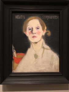
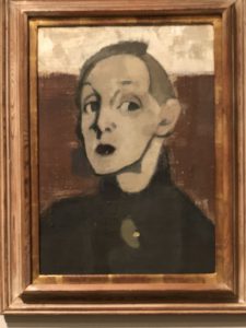
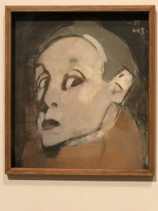
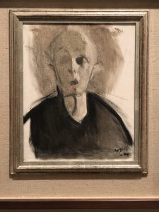
Nevertheless, the Schjerfbeck exhibition at the Royal Academy provides us with the excitement that comes from once again challenging and expanding the canon.  Let’s hope we see more museums willing to take these risks.
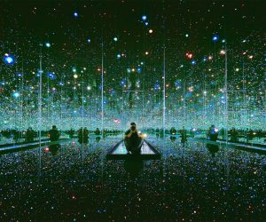
Been there, done that?

It was late spring 1977 when a young man asked to see me in my office at the Baltimore Museum of Art, of which I was director. In line with my policy of not screening visitors, I invited the fellow in. He introduced himself as John Kinsley, and said he was a poet. He was slightly scruffy, albeit very polite, and carried a small insulated cooler – the kind one takes along on picnics. He then asked whether he might use my conference table, and when I assented, he proceeded to open his cooler, taking out some wooden blocks, which he arranged on the table. On top of the blocks he placed ice cubes, the entire assemblage spelling out M-E-L-T. John then told me that he wanted to recreate this word (poem) in large form on the museum’s front steps in mid-summer. When I asked how this could be managed, he said he had already arranged for an ice company in Pennsylvania to deliver blocks of ice, and that this could all be done at no cost to the museum; he would use his own money. I was concerned about whether the museum steps could bear the weight of so much ice (15 tons!), but since I found the idea intriguing, I agreed to have engineers check whether this was safe and feasible. They assured me that it was.

Planned for the weekend when July and August met, the event was postponed for a week because of intense July heat and floods in Johnstown, Pa., from where the ice was to be delivered. So the event happened the following week-end, early August, with what would pass for considerable fanfare in Baltimore. According to local art critic, Barbara Gold’s, report in the Baltimore Sun (my memory isn’t sufficiently detailed), there were seven tiers of 120 ice blocks, each block weighing 300 pounds, held together by lucite pegs. The poem was 60 feet long and titled Revenge on the Winter of ’77. Many people came to watch, and there were a large group of stalwarts who spent the sweltering night watching the ice poem turn into water. I was one of them.

Having grown up in Buffalo and having missed (but read about) the infamous Winter of ’77, perhaps I had a special affinity to young (age 29) John Kinsley’s poem. But like most ‘sensational’ events, this one passed with minimal outside notice, other than the double page spread of an aerial view of “MELT” in a national magazine whose name I’ve forgotten.

Memory of this long-ago non-event came rushing back to me when I visited the exhibition, Olafur Eliasson: In real life, at London’s Tate Modern. A much-celebrated show about a much-celebrated artist, the exhibition warranted a long and thoughtful piece by Ingrid D. Rowland in The New York Review (9/26/19), where she wrote:
“To focus public attention on the present unfolding tragedy, Eliasson has created Ice Watch, blocks of eerily blue Greenland ice set out to melt [in Copenhagen, then Paris, then London]. The installation brings a miniature version of Greenland’s catastrophic melt close enough to touch…”

I decided not to worry about the amount of energy expended on transporting actual Greenland ice around Europe, although I did remember that John Kinsley was only moving ice from Pennsylvania to Baltimore. His poem also predated current concerns about global warming, which may have impacted the notorious Winter of ’77, even if few people recognized it at the time. Nevertheless, the Eliasson exhibition is a reminder that there’s not a lot new under the sun – other than his sun. The artist’s 2003 work, The weather project, still resonates with me as the single most impressive of the many

Turbine Hall installations at Tate Modern. That challenging cavernous space has never again been so wholly engaged, despite valiant attempts by an array of celebrity artists.

The Eliasson exhibition may be most exciting for visitors with short memories or minimal knowledge of other artists whose work it recalls. That excludes the once-young Mr. Kinsley, who considered himself a poet (not an artist), and whose whereabouts I have been unable to determine, despite my best googling efforts. Many of the works in the exhibition play with our ideas about sensory issues. However, of the five senses – sight, sound, smell, taste, and touch – only the first two work in a museum gallery context. Touch is surely verboten! For smell and taste you would need to visit one of the Tate’s several eating venues.

At a moment when people are queuing up for hours to experience Yayoi Kusama’s mirrored rooms,

Eliasson’s walk-through Kaleidoscope (2001) – for which the Tate is stuck apologizing because it’s not handicapped accessible – actually isn’t very  
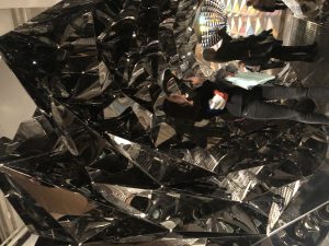
interesting.  And one wonders whether either artist ever encountered the wonderfully concise MirrAnd oneored Room (1966) by Lucas Samaras (Albright-Knox Art Gallery, Buffalo).

And walking down New Bond Street the other day, I passed the Opera Gallery, in whose window I saw yet another ‘with it” artist (Anthony James) playing with mirrors in a manner that was quite effective.

Eliasson’s large disk with projected moving forms is a version of Thomas Wilfred’s many ground-

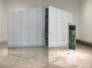
breaking Lumia works, which he began as early as 1919, and which were the subject of a compelling recent (2017) exhibition at the Yale University Art Gallery.

When museums celebrate (or should we say promote?) artists with major of-the-moment reputations, it would be helpful to give viewers some context. Eliasson’s experimental workshop and engagement with young people, as well as his political activism, can be applauded without the pretense of suggesting that his ideas have no precedents. Happily, a concurrent Tate Modern retrospective exhibition of the Greek artist, Takis (real name: Panayoitis Vassilakis, 1925-2019) reminds viewers (although there seem to be fewer of them than in the Eliasson exhibition) that many artists have experimented with technology and perception.  Although a few early works demonstrate his aesthetic origins in Cycladic art, Takis experimented endlessly with perceptual issues involving magnetism, sound, and space.

And Takis even shares with Eliasson the relatively rare commitment (or artists) to political activism.

I remember working on an exhibition, Directions in Kinetic Sculpture, organized by Peter Selz at the University Art Museum (now Berkeley Art Museum/Pacific Film Archive) in 1966, when the gentle and affable Takis arrived to assist with the installation of his sculptures. The show also included work by Fletcher Benton, Davide Boriani, Robert Breer, Pol Bury, Gianni Colombo, Gerhard von Graevenitz, Hans Haacke, Harry Kramer, Len Lye, Heinz Mack, Charles Mattox, George Rickey, Takis, Jean Tinguely, Yvaral. Vasarely) I had recently arrived from helping on the exhibition, 2 Kinetic Sculptors: Nicolas Schöffer and Jean Tinguely, organized by Sam Hunter at New York’s Jewish Museum. What was then generally called “kinetic art” has a significant exhibition history . I guess that one should feel satisfied to see that, now and again, museums remind us, even if unwittingly, about the nature of art and discovery.  But they could do better telling visitors about the shoulders of nearly-forgotten artists, if not giants, on which so many of today’s artists stand.

Auschwitz: One of these things is not like the other….


During an early October (2018) visit to Auschwitz (my fourth or fifth time; my first was in the summer of 1963) with an extraordinary group of friends under the auspices of FASPE, I was once again reminded that one picture is definitely not worth a thousand words.  A small country cottage stands across from the railroad tracks near the entrance to Auschwitz I, and in the yard is a jungle gym for the kids of the presumably Polish family who presumably live there.  I could not help but wonder whether they had any knowledge or understanding of those tracks.

How could I not be reminded of the jungle gym we have set up for our grandchildren at our Royalston (Massachusetts) farm, although we’re a tad more rural and the rail tracks in the south village aren’t as regularly active as the ones at Auschwitz once were.

But the experience took me back to the late 1970’s, when I was persuaded to organize an exhibition and compile a catalogue of art created in concentration camps– I believe the first such exhibition in the USA — from the collections of the museum at Kibbutz Lohamei Ha’Geta’ot (Ghetto Fighters’ Kibbutz) in Israel.  The kibbutz was founded in 1949 by the last survivors of the Warsaw Ghetto Revolt.  Miriam Novitch, an indefatigable member of that group, had assembled the collection from a variety of sources (survivors, their families, and probably some unsavory places as well).  I had been introduced to her by art patron and collector (primarily of contemporary British art), Melvin Merians (1929-2009), who presciently persuaded me that this material needed a more public viewing.  The exhibition was shown at the Baltimore Museum of Art, of which I was then director, and subsequently at New York’s Jewish Museum, Harvard University, and several other venues.  This was almost a decade before Claude Lanzmann’s 1985 film, Shoah, transformed or reanimated interest in the Holocaust.

Even then, I had an uneasy sense about using art to generate interest in the Holocaust.  I had always known that my sister, Margit, born in Berlin in 1928, had been deported — presumably to Auschwitz — and we assumed had been murdered there.

But it was only in 1983, after the publication of Serge and Beate Klarsfeld‘s monumental book, Memorial to the Jews Deported from France, 1942-1944, that my family learned the details: the precise date of her deportation from Drancy (November 6, 1942), the train number (convoy 42), and the names of the other victims on that train.

In those days, before the fashion of ubiquitous Holocaust museums, treating art as an potential entrée into a horrible subject seemed appropriate.  Indeed, the first book that presented so-called Holocaust art was I Never Saw Another Butterfly: Children’s Drawings and Poems from the Terezin Concentration Camp, 1942-1944, edited by Hana Volavkova (1904-1985).  She was the only curator of the Central Jewish Museum — the massive Prague-based Nazi project to collect all Jewish artifacts — to survive the war.  Originally published in 1959, this extraordinary book was a bestseller in its time, and remains in print today.

Surely images can give us insights.  After all, the “utilization” of images to educate while also manipulating a range of sentiments lies at the heart of much religious art.  But images can also mislead us.  Here’s my iPhone photo of the notorious sign at the entrance to Auschwitz, decorated by the first touches of fall foliage.

Now check out the elegant allée of poplar trees just a few steps away.

How could I not be reminded of Van Gogh’s painting, L’Allee des Alyscamps, Arles (1888)?

And also any number of other poplar images that were a staple of French Impressionist painting, such as Claude Monet’s 1891 Poplars on the Epte.

I also thought about the poplars at my farm, since I watch them intently all summer.  They have a special elegance about them which makes me understand why the French painters found them so alluring.  Indeed, we sit and watch the poplars to check on the wind, since their leaves are so light and delicate that they flutter in the slightest breeze.

But this has nothing to do with the Holocaust, and although I’ll surely remember Auschwitz next summer when I sit and contemplate my trees, I’m not sure I want to see them as a permanent mnemonic device to conjure up thoughts of the Holocaust.

Images can be confusing in so many ways.  In the days when I used to lecture about Holocaust art, I often began with the series of paintings by the American artist, George Bellows (1882-1925).  He had read about the Battle of Dinant, one of the earliest conflicts of World War I, when German troops invaded that Belgian town in August 1914.  In 1918 Bellows produced a series of canvases, which he called Massacre at Dinant, that includes images easily read as Holocaust images, such as The Return of the Useless depicting a railroad box car and violence.

In this series Bellows also painted The Germans Arrive, and

The Barricade.

Bellows was probably inspired by a magazine article published in February 1918 by Brand Whitlock, titled “Belgium: The Crowning Crime” or by an earlier (May 13, 1915) New York Times article.  The war was over by the time these works were shown, so they have to be viewed in the context of history painting, which is an altogether different subject.  Nevertheless, a superficial reading of the works could lead us elsewhere — for example to the idea of pre-Holocaust imagery.

Surely Bellows knew he was following in the footsteps of Francisco Goya (1746-1828), whose majestic Third of May, 1808 was painted in 1814 to commemorate Spanish resistance to the Napoleonic occupation of Spain.

Pablo Picasso (1881-1973) responded more rapidly to an important historical event.  Hearing about Nazi planes, in support of Franco’s forces, bombing the Basque town of Guernica on April 26, 1937, Picasso started to work on Guernica by May 1st, creating what is surely the 20th century’s most significant political painting.

Nevertheless I wonder whether there isn’t an inherent danger when we rely too heavily on “art” for our understanding of tragic events.  Sometimes we may misunderstand.  This woodcut of a watchtower from the page from the Camp Amache Christmas Calendar might be misleading if we’re told that it’s from a relocation camp.    Officially the Granada War Relocation Center, opened in 1942, Camp Granache was one of the venues for the “relocation” of Japanese-Americans during World War II.

But one tower isn’t necessarily just like another, as we can see in this drawing from Thomas Sgovio’s 1972 drawing of the harsh conditions in the Soviet Gulag.

Nor is it the same as this image by Josef Nassy (1904-1976), a Black expatriate of Jewish descent, who was one of 2,000 internees with American passports held prisoner during World War II.

Towers can be as misleading as swing sets.  Here’s a Japanese-American child’s drawing from an internment (sorry, relocation) camp, and without any context it tells us little about the circumstances of its making.

In his joyous painting, Liberation (1945), American artist Ben Shahn (1898-1969) used kids swinging amid destruction to celebrate the end of World War II

Still that’s not quite the same as our grandkids having a good old time at our farm.

The most serious exploration of Holocaust-related art — treating it seriously as both art and visual testimony — was probably undertaken by Glenn Sujo in a groundbreaking 2001 exhibition.  “Legacies of Silence” was shown at London’s Imperial War Museum, and in the accompanying catalogue/book, Legacies of Silence: The Visual Arts and Holocaust Memory, Sujo adds much-needed art historical context to the work done by so many serious artists who deserve to be viewed within the broad scope of twentieth century art.  Israeli scholar, Ziva Amishai-Meisels, has also written meaningfully about this field.

That’s not unimportant, since a number of these incarcerated and murdered artists had serious careers.  Among the best known was Felix Nussbaum (1904-44), who was born in Osnabrück and trained in Berlin.  His 1943 self-portrait as a painter, executed while he was in hiding in Brussels, contrasts with another one of the same year, in which he shows himself with a “Jewish passport.”

In one of his last pictures, Threesome (1944), he clearly identifies himself as a Jew.  Not long after completing this painting, Nussbaum was murdered at Auschwitz.

Nussbaum is now celebrated in the Felix Nussbaum Museum, part of Osnabrück’s Cultural History Museum, which was opened in 1998 in a building designed by architect Daniel Libeskind.

My own “favorite” among these artists is Prague-born Malvina Schalkova (Schalek) (1882-1945), who managed to create over 100 drawings and watercolors depicting scenes of daily life in Teresienstadt (Terezin) showing the inmates’ gentle humanity as they cope with their tragic situation.

Trained in Munich, Schalek had a significant career as a painter in Vienna prior to her deportation to Terezin.  She was later transported to Auschwitz, where she was murdered.  Her tender watercolor of the tired old lady in a Terezin barracks moves us because of its universal sense of compassion, not just because we know where it was created.

These ruminations stem from my encounter with the sense of quotidian humanity expressed by a jungle gym at the entrance to Auschwitz.  I don’t know anything about the family living in the small cottage by the railroad tracks.  I have to assume they are folks who found a reasonably-priced plot of land on which to build their house and raise their kids.  I wish them well.

I’m posting this on November 7, 2018.  That’s a sort of frightening day — arriving between an American election in which too many voters ratified a President spewing xenophobia and hate, and the 80th anniversary of Kristallnacht, which (we need to remember) didn’t arrive until five and a half years after the Nazis seized power.

Celebrating My CellPhone

I’ve never been an avid user of audio tours, although I recognize their utility for many museum visitors. So having them available on my smartphone doesn’t do much for me. (And on the few occasions when I wanted to check out what was being said, I’ve often found the museum’s wifi signal too weak.)  But often I do like to take photos of interesting works, or close-ups (or enlargements) of something that fascinates me. On the other hand, I was impressed that the Prado doesn’t permit photographs in the galleries. That makes it possible to view revered works (e.g., Las Meninas) free of enthusiastic selfie-takers.  And for the intrepid viewer, there are ways to calculate the guard’s path, so that it’s possible to work surreptitiously while the guard is making his/her rounds (albeit not in front of Las Meninas).  More about that later on.

The smartphone is my steady friend for helping me check on visual relationships that I think might be evident — while also reminding me that my visual memory might not be all that I assumed it was.  So even while passing a Bond Street shop (Pronovias), a dress (below, left) in the window caught my eye because I thought I had recently seen it (below, right) somewhere (at the Met Cloisters segment of Heavenly Bodies: Fashion and the Catholic Imagination).

My phone helped me check my memory!

I’m not certain why I found myself fixated on the depiction of linen in a pair of paintings, hanging side-by-side (for easy comparison) by Andrea Mantegna (ca. 1454) (below, left) and Giovanni Bellini (ca. 1470) (below, right) in the splendid eponymous exhibition of their work currently at London’s National Gallery.

But there I was, a few days later, at the Royal Academy, trying to figure out the amazing early 16th century copy of Leonardo’s Last Supper,

which has until recently not been on view.  I was struck by the linen tablecloth and wondering how closely it might relate to the swaddling cloths on the Chirst child in the two Presentation of Christ in the Temple I had just seen.

Not as close as I imagined, but the phone photo was a great way to check it out.  And a couple of days later the swaddled Christ child image came back to me when I saw a white Meiping (plum-blossom) vase among the British Museum’s vast Chinese ceramics displays.


Yes, I know they have nothing to do with each other, but thanks to my phone I could check out what I thought I remembered.  This keeps happening — surely not only to me — and I relish the opportunity to check out my [perhaps failing] memory, as when I saw William Etty’s Standing Female Nude (1835-40) at the Tate Britain (below, left), and was sure that Thomas Eakins’ study (below, right), William Rush’s Model (1908) was similar (or a ripoff).  Wrong again!  Because it’s a study (one of several) of a front-facing nude, very different from the 1876-77 version in Eakins’ famous William Rush Carving His Allegorical Figure of the Schuylkill River.

The proximity of those visuals dancing in my head also changed the way I looked at the wonderful Roman 2nd century AD marble Venus I encountered at the British Museum a day later.  Checking out photos stored on my phone expands the experience enormously!

A Mantegna drawing, Three Studies for the Dead Christ (ca. 1455-65) (below, left) in the National Gallery show brought to mind the artist’s dramatic and (for me) memorable, highly-foreshortened The Dead Christ and Three Mourners (1470-74) (below, right) now in Milan’s Pinacoteca Brera.  I was certain the drawing was similar to the painting; but the ability to access the photo of the Milan painting while in the London gallery looking at the drawing helped me see the differences.  Exciting!

The phone camera’s zoom ability often assists in viewing things that are simply not otherwise visible.  For example, in a current British Museum exhibition, I was able to photograph close-up details that I really couldn’t see in the exhibition cases, although they were diagrammed on the accompanying labels.

Thomas Spence (1750-1814) was an English radical who defaced coins, as this one attacking Prime Minister William Pitt.  My phone helped me see it!

As it also did this 1897 anti-papist British one-penny coin.

As for my having fun tracking the guards at the Prado, I close this blog by sharing my “purloined” photos from Room 56A.  I was mesmerized by Bosch’s Adoration of the Magi triptych (1494), despite the big crowds that were focused on Bosch’s Garden of Earthly Delights (1490-1510) across the room.  Managing the crowds at the more popular painting is a serious task for the gallery guards.  Far fewer people pay attention to the Adoration, which was the painting that really captured me.  Still, I was unable to get a full sense of the finer details — the gold gifts being presented to the Christ Child, the wonderful scenes embroidered on the robes, the men on the roof.  Here’s where my camera would help — but not with guards around.  So I spent a lot of time watching the security path, figuring out when I could capture closeups (“Alright, Mr.Bosch, I’m ready for my closeup!”).

Now, thanks to a guard that maintained a predictable routine march through the gallery, I could really check on the details that help make this painting so amazing, whenever the guard wasn’t nearby.

I like to think I wasn’t bothering anyone by breaking the rules.  (That’s what they always say…..)  And I’m hoping that museum wifi systems continue to improve, so that we can expand our uses of increasingly helpful cellphones.

On Museum Interventions

The recent announcement that even the Frick will soon be playing the museum intervention game reminded me that so-called “interventions” in museum installations have been around for a long time.  I’m not sure whether he invented the concept, but Leslie Cheek, Jr. (1908-92), one of my predecessors as director of The Baltimore Museum of Art, and subsequently director of the Virginia Museum of Fine Arts, surely ranks as one of the pioneers of the museum-as-theatre mode that underpins many of today’s interventions.  Smaller and regional museums have special challenges in attracting visitors, since they don’t benefit from the automatic tourist throngs that constitute a substantial proportion of visits to museums in large metropolitan areas.  So it’s understandable that dramatic flourishes will have a special appeal to directors and staffs of those museums which need to work harder to attract repeat visitors.  The Worcester Art Museum, of which I was also director, has an ongoing tradition of “flower arrangements inspired by works of art” every winter.  I vaguely remember that it helped swell visit counts.

Still, it’s difficult for any museum to compete with the Metropolitan Museum of Art‘s recent Costume Institute blockbuster, Heavenly Bodies: Fashion and the Catholic Imagination.  The spectacles of most recent Costume Institute shows have reached new heights in pushing the extremes of museum installation techniques; so it feels somewhat curmudgeonly to complain that the extravaganza often elbows out whatever passes for serious content in these exhibitions.  The “catalogues” are presumably replete with weighty information, but I don’t invest in those props, which are quite costly (“It’s not a coffee table book; it’s a coffee table!”), albeit splendid.

There’s evidently an ongoing competition for each year’s museum fashion divertissement to outdo its predecessor.  With the added incentive of a certain content logic, this year’s exhibition played at two venues: the main store, now called “The Met Fifth Avenue” and farther north in Fort Tryan Park, John D. Rockefeller, Jr.’s amazing gift to New Yorkers, now known as “The Met Cloisters.”   While in previous years I tried to focus on the fashion content, albeit distracted by the glories of the installation, this time I found myself more interested in what happens during an intervention.  The fashions were jauntily installed in the midst of presumably related collections.  Certainly the medieval and Byzantine galleries housed dramatically placed dresses, 

although I found it a bit weird to move through the Byzantine corridor and look up the skirts of the rows of sequined dresses.  (I guess this obviates the old mirror-on-the-shoe trick.)

I can’t have been the only museum person to check out the visitors, to see whether any of them were also looking at the medieval or Byzantine art — wondering what the religious or visual connections might be.  But there seemed to be little of that.  Instead of the array of confused stray visitors trying to figure out which direction to follow, in the process bypassing some  inspiring Romanesque and Gothic carvings, people were stopped short by the glitter of gaudy fashion, at best tenuously linked to the art in the Medieval Court (officially Gallery 305).  The last time one saw such rapt crowds in that space was at Christmastime, for the Met’s annual display of the gorgeous  Christmas tree decorated with 18th century Neapolitan polychrome figures.

But the Fifth Avenue museum is so capacious and diffuse, and way-finding for the uninitiated is so complicated, that there seemed to be a general consensus that the Heavenly Bodies exhibition fared much better at the Cloisters.  For one thing, there’s a more-or-less unified visual environment in the mélange of bits and pieces of mostly ecclesiastical, mostly medieval, structures serving as a background for a great collection of medieval art.  For me it’s worth a visit just to see the so-called Mérode Altarpiece, the sublimely beautiful 1427 triptych, Annunciation with Donors, ascribed to Robert Campin and his workshop.

A single elegant red velvet gown, whose designer’s name I can’t recall, was placed (not quite juxtaposed) in that room presumably to relate to the Virgin’s crimson robe; but alas, the painting far outshone the fashion.  Not that anyone seemed to be looking at the painting, although it’s high on many lists of the great works of art resident in New York.

Most of the other fashion interventions were more visually dramatic, and thus presumably more successful — from an “installation glamour” point of view.  I’m skeptical about using The Met Cloisters and fashion to promote the idea of faux piety, but there’s no denying that some  breathtaking theatrical ensembles were created.

If by “the Catholic imagination” we are meant to understand fantasy, then this section of the exhibition succeeded better than previous Costume Institute extravaganzas which depended primarily on brilliant stage designers/installation artists.

Where it worked, the architectural setting was wonderfully evocative.  But these were about formal concerns and about riffs — some pretentiously sanctimonious, others slyly blasphemous — which is what much of high fashion is about anyway.

Were we meant to see “the Catholic imagination” as humorous?  Perhaps.  Ironically the most object-based juxtaposition  — by which I mean inviting comparison of a museum object with a fashion object — concerned death, with the placement of a dressed model next to a stone tomb.

Now and again visual themes or images from”art” turned up, and although they were sometimes beautiful, they screamed superficiality.  My favorite was the fluffy-skirted dress with the embroidered unicorn on the jacket.

Since the Unicorn Tapestries (1495-1505) are among the most popular of the works on display at the Cloisters, this was fun to see (would that the dress had been more attractive).  And my sense was that it was the one room in which people were casting their eyes back and forth between the embroidered jacket and the tapestries on the wall.  Since unicorn carries layers of meaning, both religious and erotic, this maybe-a-wedding-dress did not feel out of place here.

The workmanship involved in creating a sexy Adam & Eve-ning gown was as awesome as some of the artistry involved in making the medieval art symbolically elbowed out by this fashion show.  But to me it felt like just another use of a visual theme, plucked from art, that we often see on all sorts of clothing, albeit on a much more refined level here.

Elsewhere, playing  architectural forms against straw hats turned out to be an especially engaging trick.

Yes, I realize that much of (most of?) this “fashion” isn’t necessarily meant to be worn by real people.  Maybe that’s why the Met calls that department Costume Institute?  In which case maybe theatre designs by Picasso or Schlemmer or Hockney could be shown by that museum department.  But no — that would likely be under the aegis of one of the other “departments.”

What struck me the most at both venues of this spectacular “fashion” exhibition was the problem created by placing the “clothes” in the middle of collection galleries.  The primary message in doing this is that the museum’s holdings can serve as theatrical props.  There is little evidence that visitors engaged with the museum’s own works while ogling the clothes.  (I would love to be proven wrong; perhaps the Met has done a serious study of this.)  I’m an inveterate museum eavesdropper, and my favorite collection-based comment was overheard at the Cloisters, as a lady was mistakenly reading a label for the room’s architecture, thinking it was for a dress.  “I thought Catalonia was in California,” she said.  Her friend told her she was thinking of Catalina Island.  But the not-so-far-from-Hollywood reference seemed very apt to me.

The Met’s recently-appointed director, Max Hollein, has said: “I’m not so keen on putting one contemporary piece smack in the middle of the Greek and Roman gallery and saying, ‘Well, here is a dialogue.'”  That’s reassuring, and we’ll see about that soon enough.

Meanwhile, back in intervention-land, the Frick Collection has announced that in 2019 an exhibition by celebrity British ceramic artist, Edmund de Waal, “will be displayed in the museum’s main galleries alongside works from the permanent collection.”  I am a great admirer of de Waal’s work, having first encountered it in his Signs and WondersI installationI (2009), which sits precariously around the upper edge of the rotunda in the ceramics galleries of London’s Victoria and Albert Museum — although you have to know it’s there and look up to see it.

So much about de Waal’s work focuses on subtlety and perception (not a specialty of Costume Institute shows), that his Frick intervention could be exciting.  Moreover, it sounds as if the idea of this exhibition is to create a visual collaboration between whatever de Waal creates and how he manages to install it.  His exquisite installation, White, which was installed in the Royal Academy’s Library and Print room (2015-16) was understated and controlled, accentuating much about this rarely-seen space and its contents.

So there’s every reason to be excited about a de Waal collaboration with the Frick Collection.

Meanwhile, back at The Met Cloisters, I was remembering one of my favorite to-do projects, although I’ll probably never get to it: I imagine sad monologues recited by lonely masterpieces that get passed by because, in the rush of blockbusteritis, no one manages to see them.  Like this guy, the magically-carved, linden wood, Seated Bishop, ca. 1495, by Tilman Riemenschneider (1460-1531).

There he was, near the entrance, ready to welcome one and all to Fashion and the Catholic Imagination.  But no one looked at the poor fellow.

Postscript:  The Met announced record numbers of visitors at the close of the exhibition.  Clearly that proves something.  And after the close.


Surprises in San Francisco

I thought I knew the SF museums well, but it’s fun to keep finding new ways of seeing familiar places.
SFMOMA – Oy! I forgot how much the new building mimics NYMoMA (or the last iteration, not the coming one). Long lines for both tickets and members area (I chose to show my ICOM card at the tickets line, which moved faster than the members line). Then the awkwardly placed ropes and stanchions for crowd control and entry; it’s as if they didn’t know they would have ticketed entry when they designed that area, which is awkward to access in any case.  But the real discovery(?) for me was the Magritte exhibition. He’s really boring (or at least they make him seem so), and a painter of limited abilities. The familiar stuff is fine (but a yawn in this installation, and in the hi-falutin art-speak on the wall panels). When he experiments(?), he’s just not a very good painter (which is why we haven’t seen those paintings in most previous exhibitions). As for the collections, it reminded me of the menus that say “market price” on some items. It’s filled with too much of the same “great names of modern/contemporary art” and too little else. (It’s difficult not to remember that many of these paintings would fetch more than Rembrandt, et al, at auction.) One can only hope that determined visitors (there didn’t appear to bee too many) will manage to find the “old” SFMoMA collections, hidden near the entry level, where the spectacular Haas Matisse is still spectacular, as are a lot of other wonderful works that remind you SFMoMA was once an early force in shaping American museum directions in contemporary art (e.g., Grace McCann Morley, etc. — she was also a pioneering woman museum director: 1935!!).  And it’s here that you will encounter some (if not enough) of the California artists you might have thought would make it upstairs in the new building.

The Contemporary Jewish Museum – It was never high on my list of admirable places, especially since the raison d’être was sort of like “if we are cultured and community-minded, then that’s the same as being Jewish [since we really wish we weren’t Jewish in the first place]”.  And it includes another one of Libeskind’s unusable (common euphemism for them: “challenging”) spaces.  So I was pleasantly surprised at the current exhibition “Contraption: Rediscovering California Jewish Artists” (16 of them) — a concept that would ordinarily be a complete turnoff to me.  But starting with Rube Goldberg (one of the few here actually born in California), this is an eclectic and interesting exhibition, with a range of artists and ideas that are much more engaging than the limited tastes shown at SFMoMA, and sort of unified by the concept that their “work refers to the machine either literally or metaphorically.”  It even includes an amazing huge interactive piece by Bernie Lubell, who was once (long ago) married to my wife’s cousin.

Legion of Honor – A bunch of not very interesting Julian Schnabel “paintings” interspersed with Rodin don’t make a convincing case for his current work. (Maybe he should stick with film?). And I forgot how uneven (that’s the kindest word) the European collection is, although there are some zappo paintings (just not enough of them). But there’s a wonderful small Cubist illustrated artist book exhibition downstairs. And a Pre-Raphaelite show, which I skipped, because my ICOM card was only good for general admission and I wasn’t about for fork over $28 for a special exhibition.

DeYoung – I’m not a big fan of the Herzog/deMeuron building (and in any case you only get to sort of see it all if you’re at the Academy of Science across the plaza). But I thought the range of what’s on view very impressive. The American art is really exciting (thanks to the Rockefellers, but not only to them), with whole groups of substantial first rate works (landscapes, portraits, trompe l’oeil

genre, etc.) and good wall panels to tell you something about each room (the Legion does that as well, but has less to work with). The display of “craft” artists (loathesome way of categorizing, my term, not theirs) is also great, mostly segregated from the rest of the art, but occasionally not. Why don’t we see Voulkos,

DeStaebler,

Viola Frey 
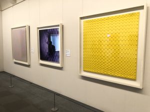
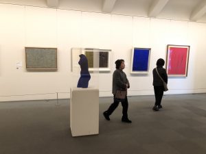
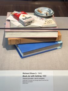
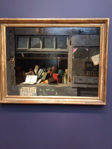
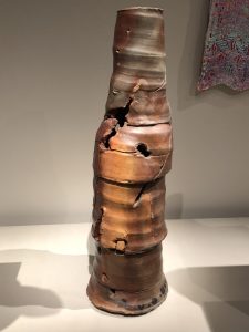
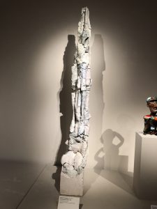
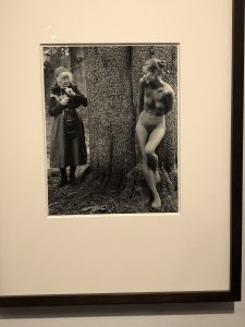
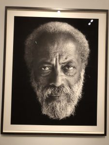
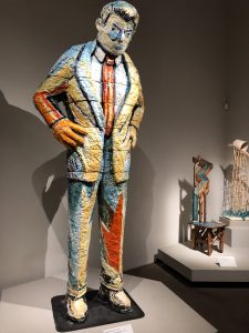
or a slew of these other artists at SFMoA (which has them in the collection)?  The strength and range of the Saxe gifts is super, especially since it does so much to expand our understanding of an important aspect of California art. There’s also a powerful Judy Dater exhibition,

as well as an exciting installation of their modern/contemporary collection that juxtaposes interesting works with one another.

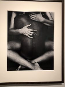
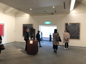
 The deYoung shows real respect for California artists (which is more than you can say for SFMoMA). It may not be a truly encyclopedic museum, but it is energetic and exciting in its range. (Again I didn’t see the special exhibition, “Cult of the Machine”, because I wasn’t about to pay $28.)
Moral(?) of the story: You need to keep going back to familiar places because you see them differently every time you visit.

Vermeer at the National Gallery of Art in 1996: – Revisiting Visitor Abuse

In February 1996, when I was working at the Smithsonian, I wrote an essay about my experience standing in line to see the Vermeer exhibition at the National Gallery.  I was never able to get anyone to publish it, and since this predated having everything on one hard drive, I lost the essay in the débris of my files.  But file archaeology recently turned up the essay, and I thought it might be fun to share it (I haven’t edited it at all), since it seems no less apropos now than when I wrote it.  Hopefully the link will open for interested readers

1996_TLF_Vermeer